Introduction
Introduction
This project is part of my Google UX Design Professional Certificate program. The idea was to create a concept of an application and a product website that would help people enhance their productivity and have a positive impact on their health. I chose this topic for my work because I use some applications and services myself and I feel that there are things that could be improved.
There are a lot of studies on the decrease in motor activity in modern life. Work and even entertainment make us spend more and more time in front of screens. At the same time, we must look for new ways to do more and be more effective. And the methods of interval time management can help us. Why not combine performance improvement and motor activity in one tool?
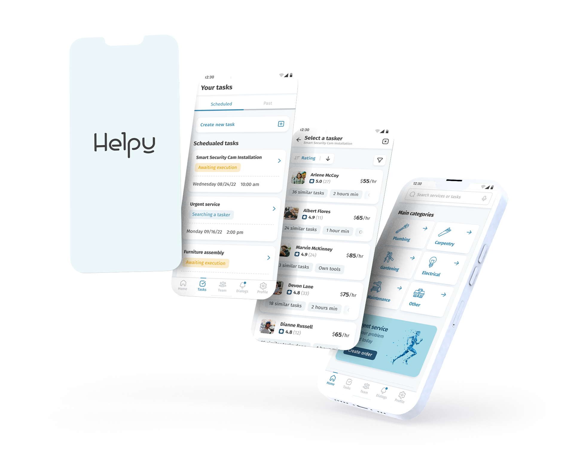
Cyclife is a cross-platform service that should help people increase productivity, manage time and improve their lifestyle.

Challenge
People who spend a lot of time in front of the computer forget about breaks, which has a negative effect on health. At the same time, they have a problem with concentration. Because of this, they need a tool that will help them structure and organize their work schedule.
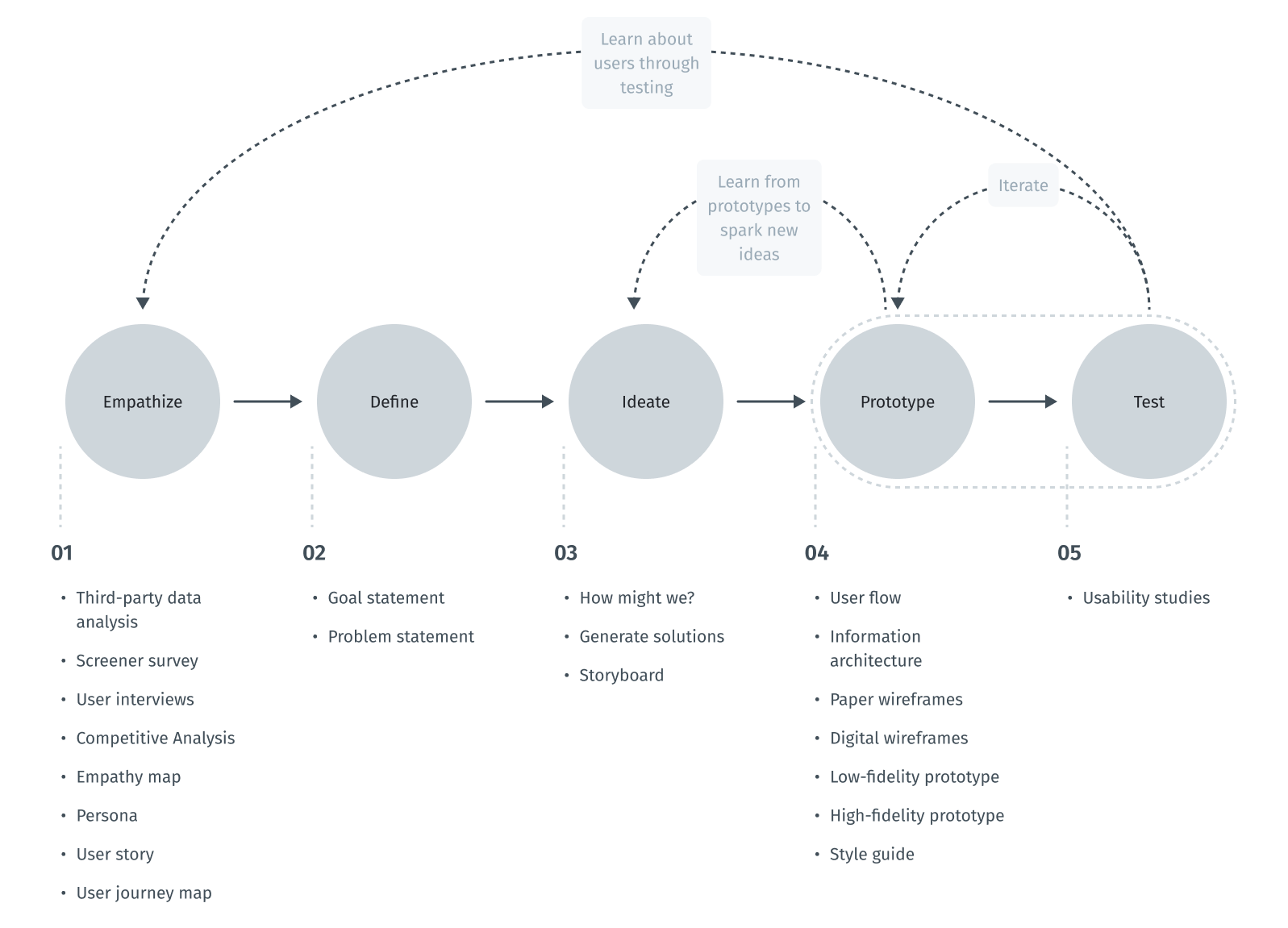
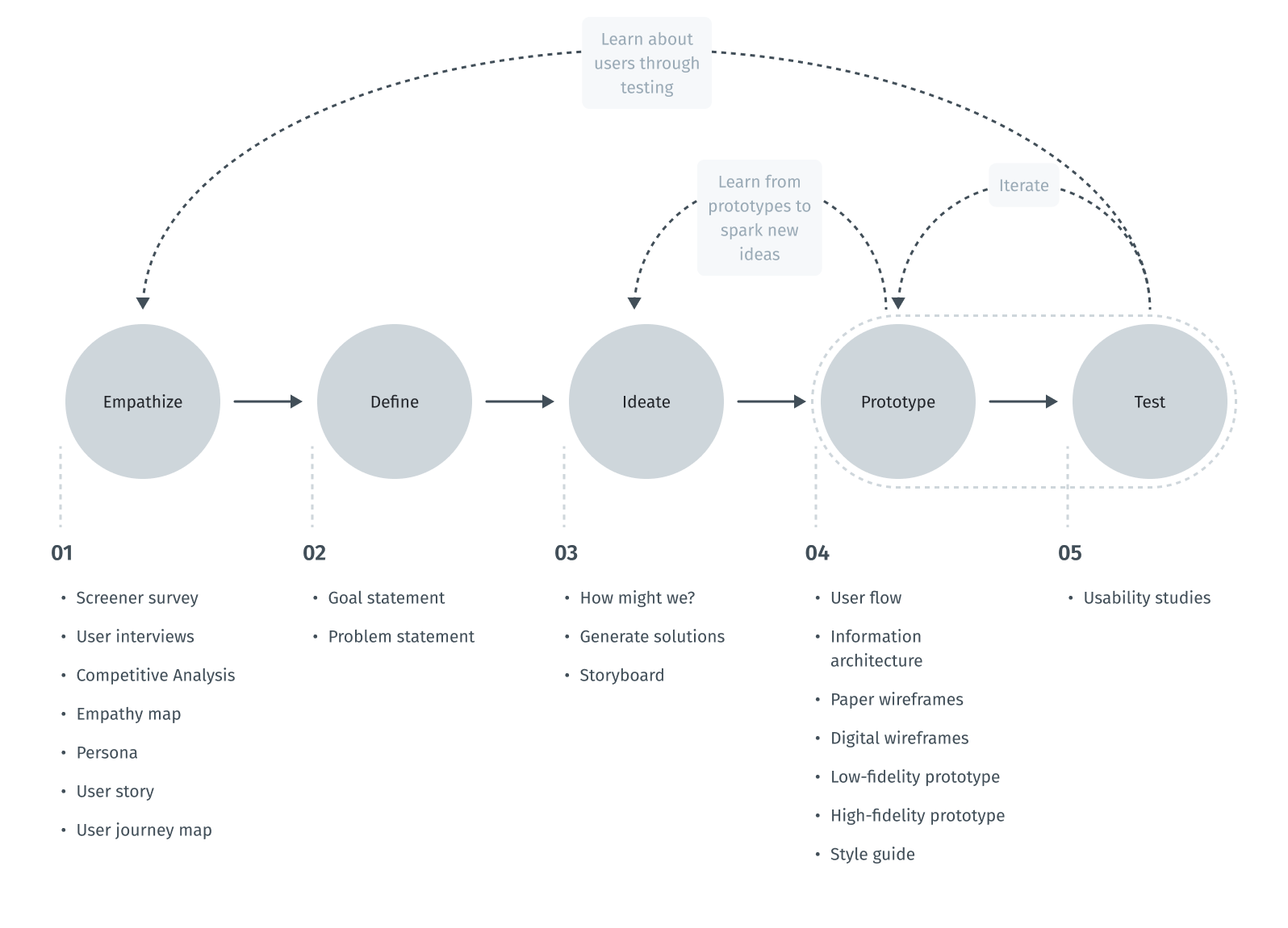
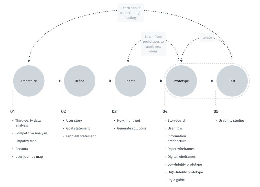
Design thinking process
The design thinking framework is based on the user-centric approach to problem solving promotes innovation and helps to act consistently.
In this case study, the steps taken correspond to the main stages of the design thinking process.
Scheme of design thinking process
Empathize
Intro to user research
To understand what users do, say, think, and feel, I had to start from research. I gathered secondary data to gain a more detailed understanding of who my end users are. For these purposes, I used search engine tools to collect social and demographic data.
After that, I conducted a competitor analysis. It gave me an insight in the market space and provided additional context for the problem we are working on.
After doing market analysis, I conducted surveys, interviewed users, and gained insight into what the problem might be.
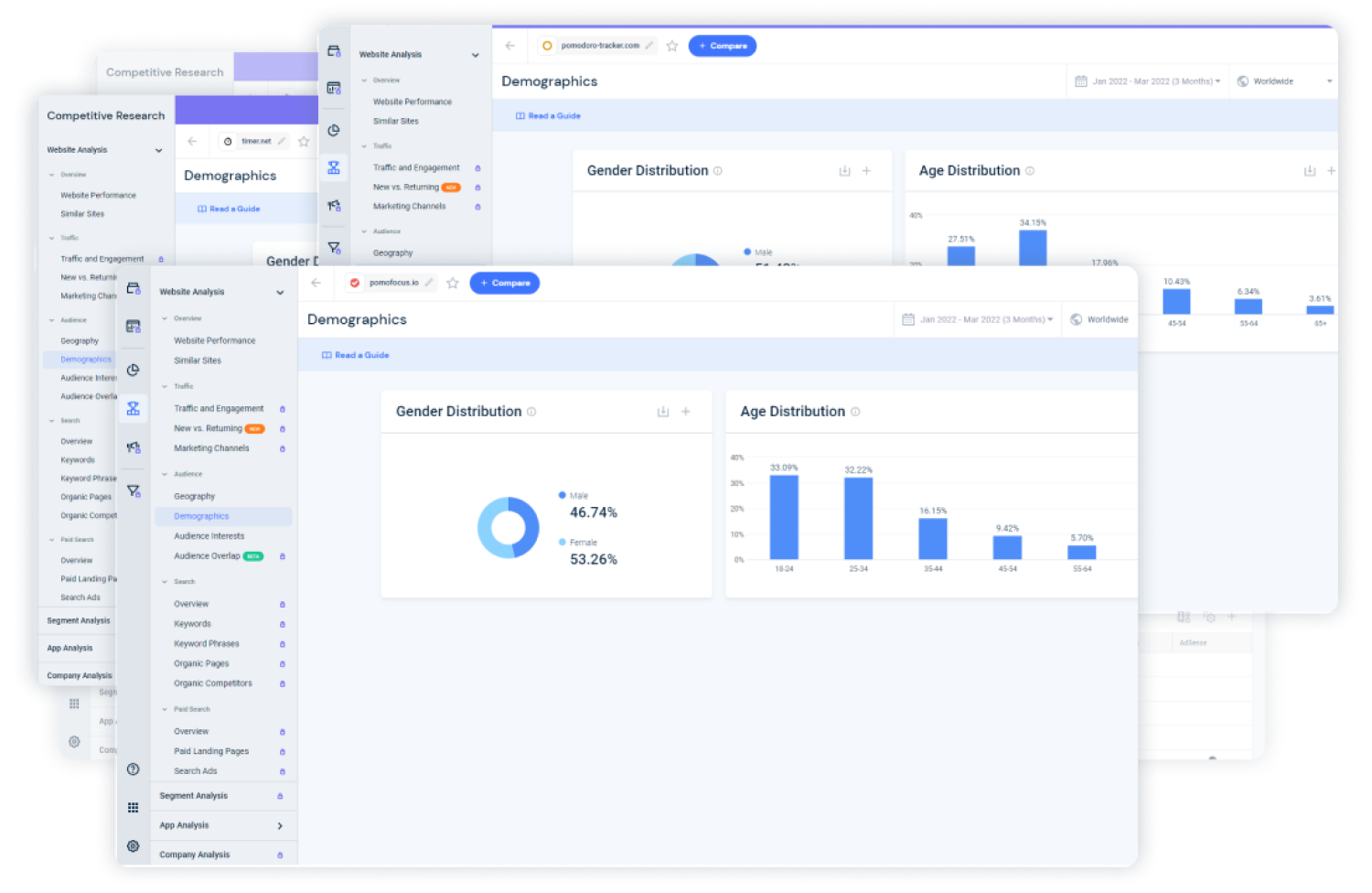
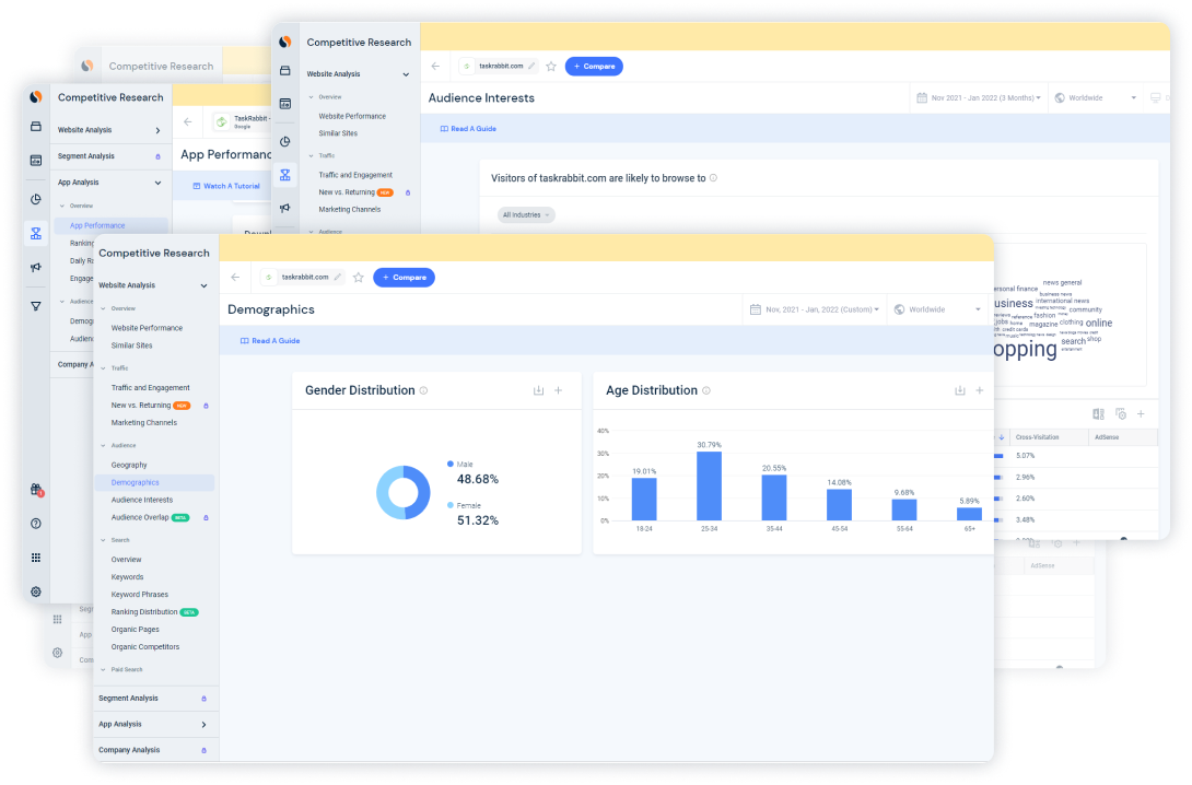
Third-party data analysis
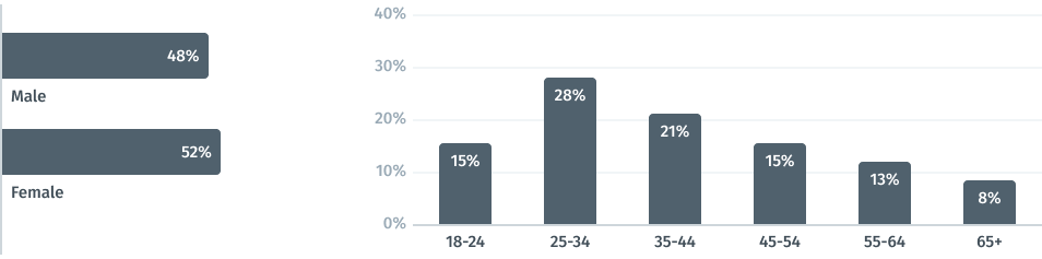
In order to understand who the typical user of time management apps and services is, I collected social and demographic data about users of most popular websites and apps in this sphere. I chose apps and websites of companies like Todoist, Any.do, Habit Tracker, Pomodoro Timer, pomodoro-tracker.com, pomofocus.io and others from the Top 10. Below you can see an example of screens from the Similarweb service.
Example of data from Similarweb
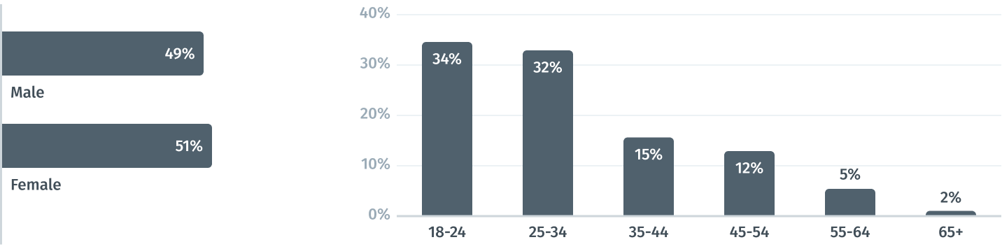
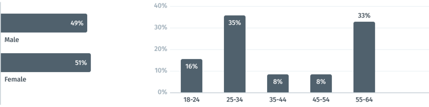
Analysis and compilation of these data revealed almost equal proportion of male and female users, which made males and females from 18 to 34 years old the target audience.
Pivot socio-demographic data
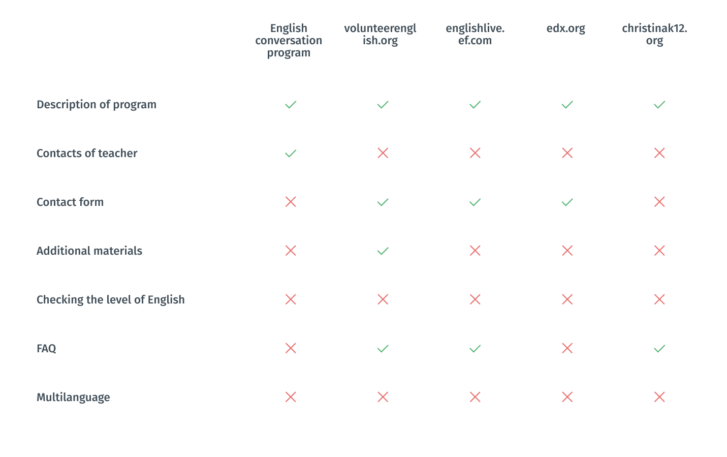
Competitive Analysis
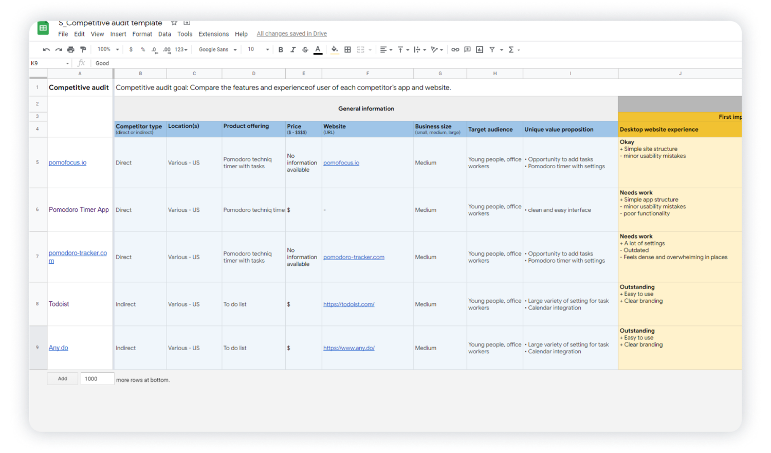
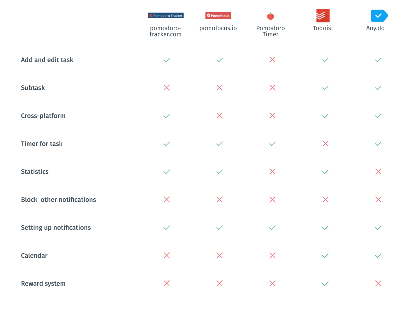
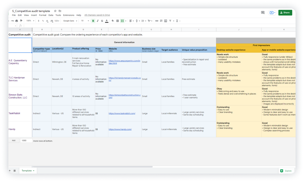
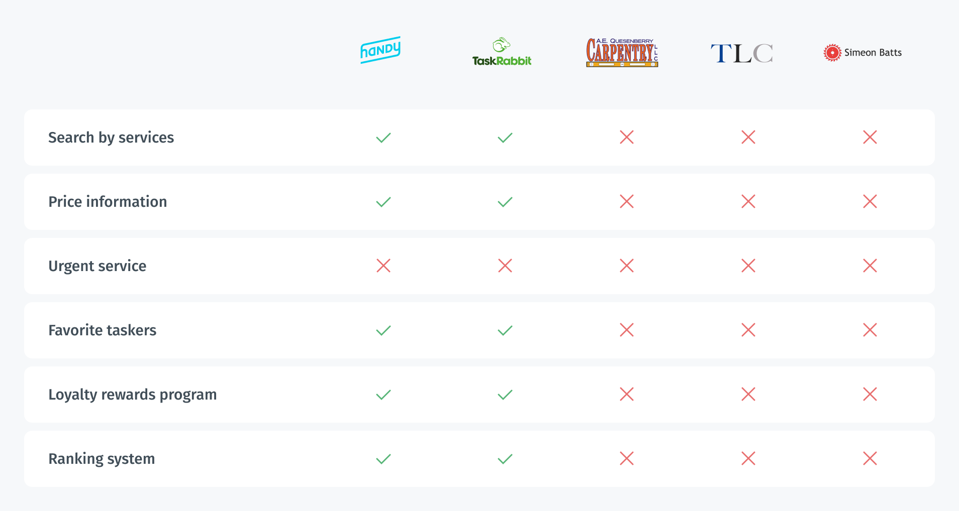
In order to construct a concise and solid foundation for the Cyclife service, I had to look at competitors and find out what key opportunities and features they have.
For comparison, I chose several services who provide pomodoro timer feature, which would be my direct competitors Pomodoro Timer, pomodoro-tracker.com, pomofocus.ioand two productivity services which would be indirect competitors and references for me Todoist, Any.do.
I conducted competitive audit and assessed competitors from different sides such as design, features, impression, interaction, and content. In the screenshot below, you can see a part of this table.
Example of data from competitive audit
In order to summarize information, I made a pivot spreadsheet for key features to better see what I should emphasize. I also created a list of features ranked by their importance.
Mandatory features and functions:
- Adding tasks. Some of competitors allow adding subtasks. It is really useful when you work with a complex issue;
- flexible setup of notifications;
- full cross-platform working with almost all types of devices include fitness trackers and watches, which is especially important if you want to include sport activities;
- statistics tracking.
Good competitor advantages:
- opportunity to block notifications of other applications during the work cycle;
- calendar has only indirect competitors but it might be helpful if you plan your schedule beforehand;
- reward and gamification system involves and stimulates people.
Pivot competitive analysis
Screener Survey
In order to obtain more quantitative research data, I created a screener survey on Google forms and offered to take it to people whose work or study process occurs in front of the computer. I wanted to gain insights into the problem space I was dealing with as well as to get information from the real world that could serve as a basis for my research so that I would not use assumptions in the design process. 22 respondents completed the survey. Also, I reached out to 5 of them for later interviewing.
Some interesting survey insights
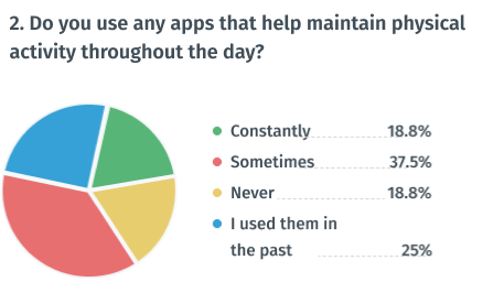
75%
of respondents now or previously used apps to maintain physical activity
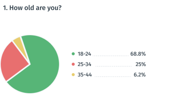
94%
of respondents are between 18 and 34 years old
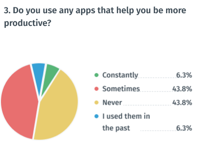
56%
of respondents now or previously used apps to maintain productivity
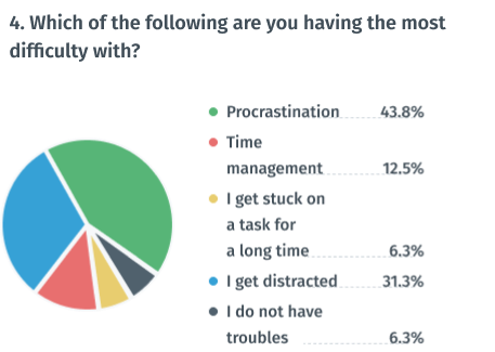
43%
of respondents believed that procrastination is their main problem
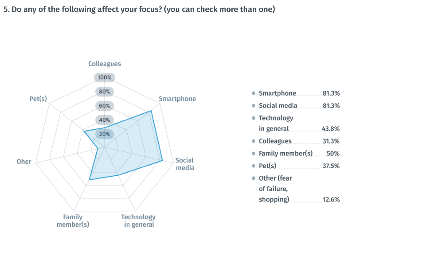
81%
of respondents believe smartphone negatively affects their focus
81%
of respondents believe social media negatively affects their focus
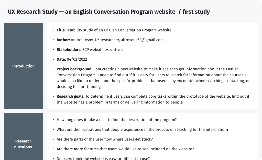
User Interviews
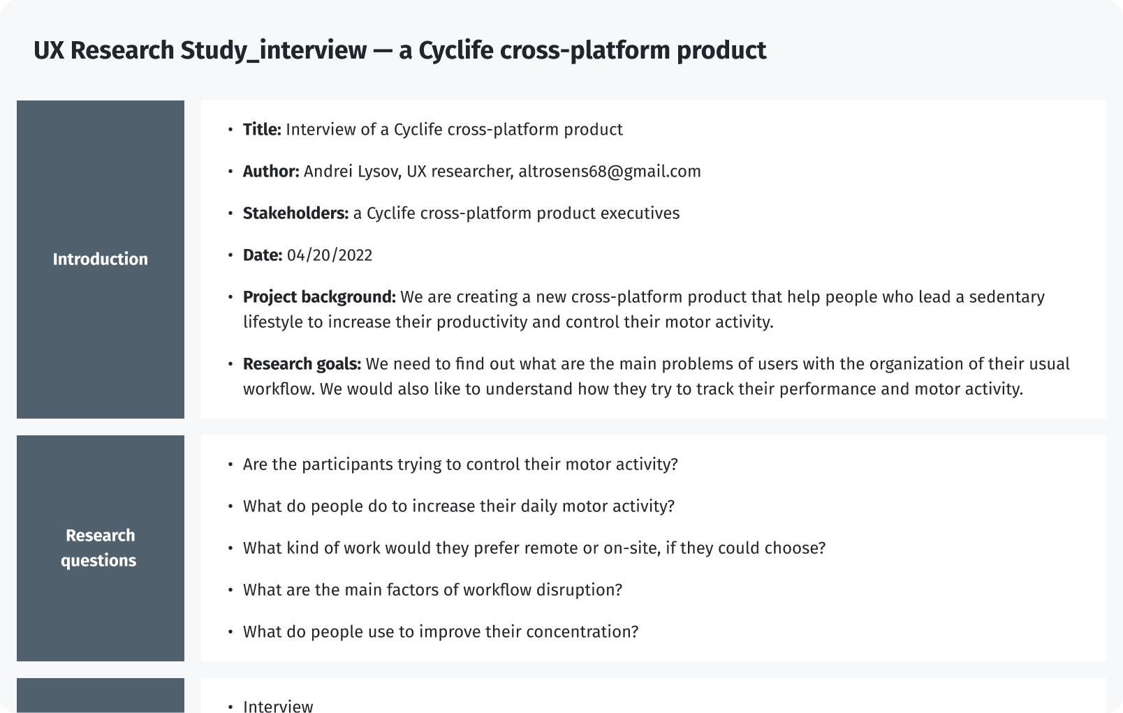
I reached out to participants of the survey to interview them. I was able to interview 5 people via Skype. Below is a screenshot of the UX Research scenario with 10 questions regarding the user's productivity habits. I wanted to gain insights into their awareness about the health impact of sedentary work. I also wanted to learn what sort of distractions the users dealt with on a daily basis and if they used any tactics or tools to help them.
UX Research Study interview — a Cyclife cross-platform product
After gathering the data from the UX Study, I used the Affinity diagram to process the results.
Affinity diagram of the UX Research Study interview — a Cyclife cross-platform product
Findings from the interview

Interview findings
- Smartphone notifications and social media distract people
- Respondents tend to maintain their productivity rather than their physical activity
- Respondents use various tools, such as timers, stickers, and a calendar
- Gamification captivates the user and helps him not to give up while following the plan
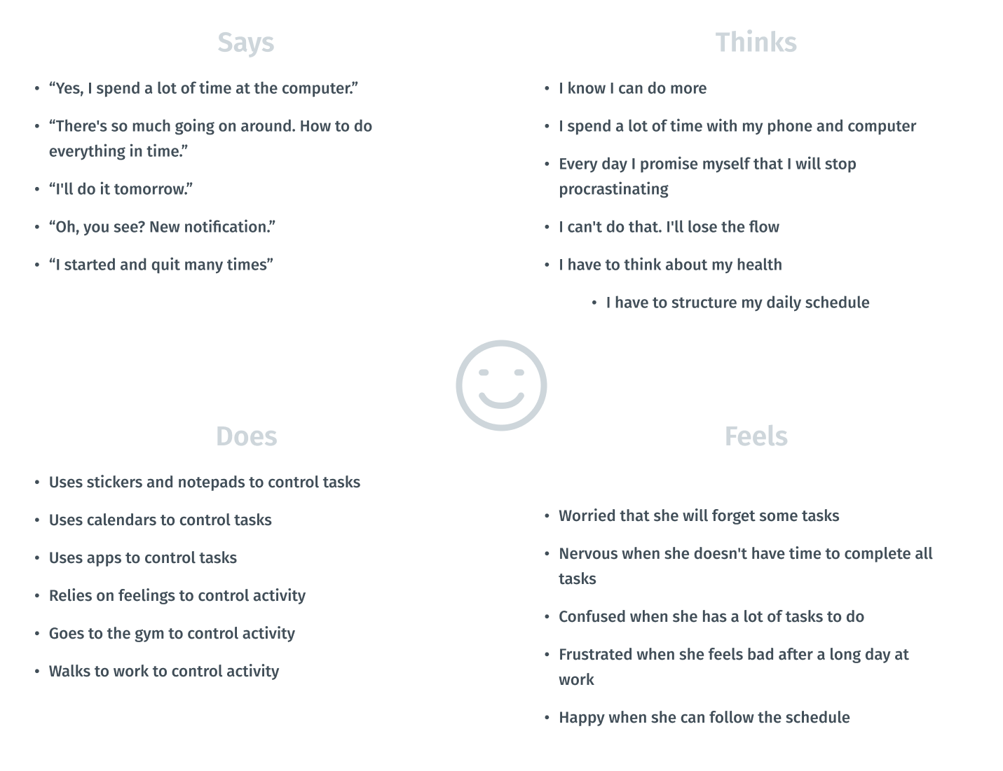
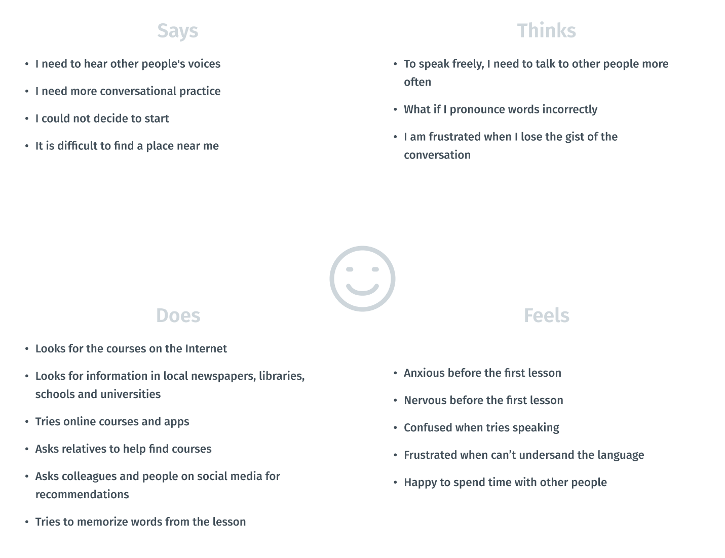
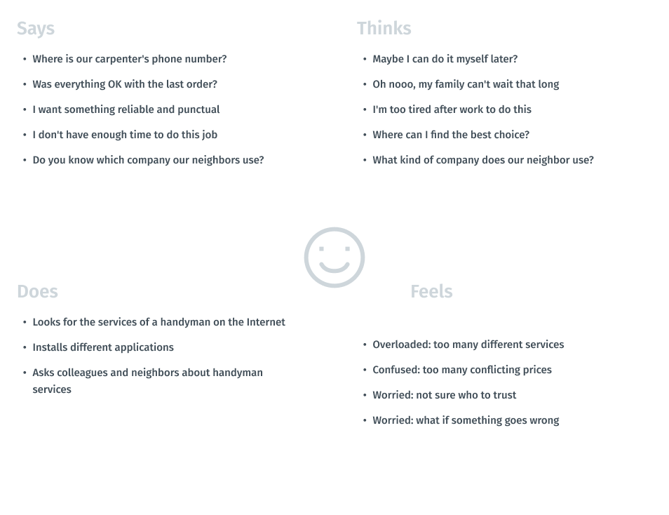
Empathy Mapping
Visualizing attitudes and behaviors of people in an aggregated empathy map gave me a better understanding of end users’ experiences.
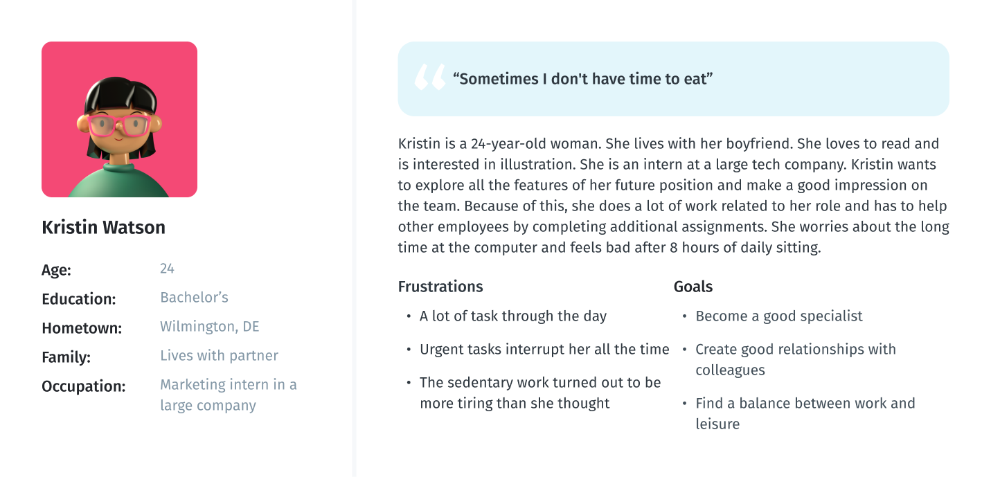
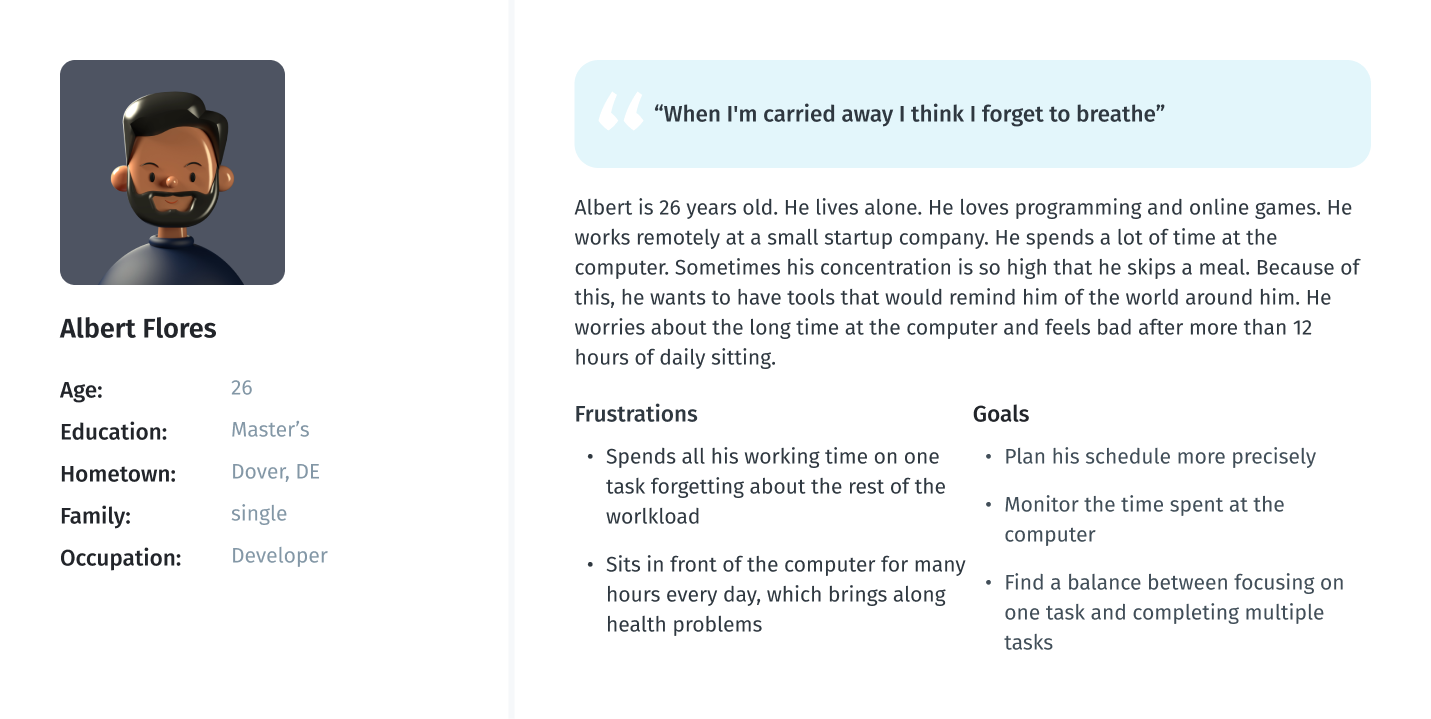
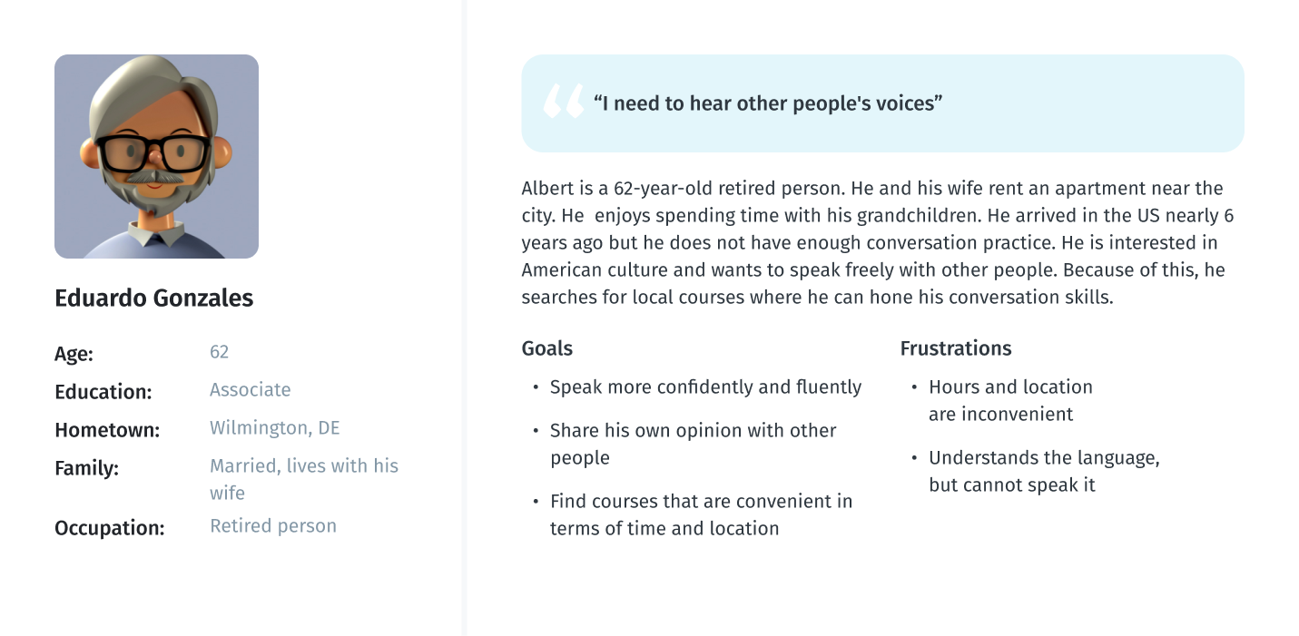
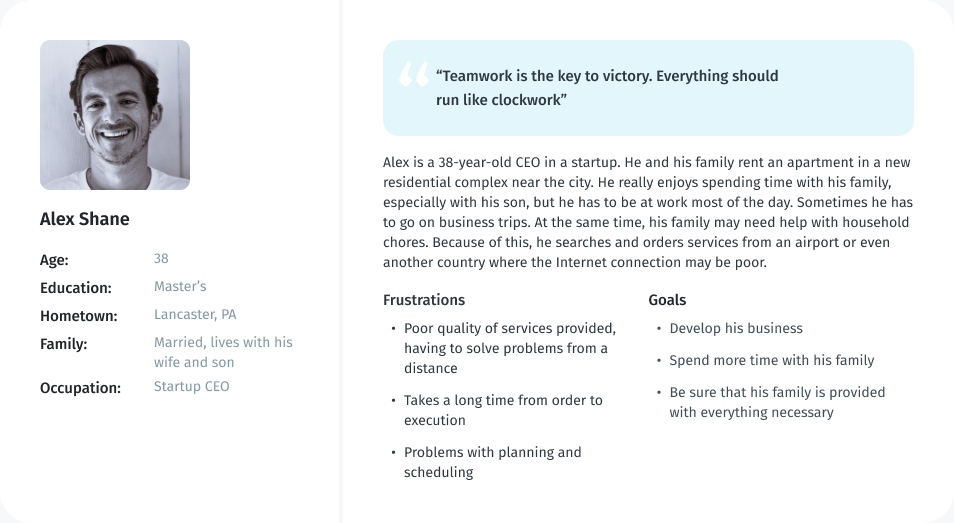
Persona
As part of processing the research findings, I analyzed the information that had been found during the research phase by creating a User Persona. This persona contains the details of the user’s goals, needs, frustrations, interests, possible quotes and other information that might be useful in the design process such as user’s profile and personality. I have created two personas, one for the mobile app and one for the web version of the service.
User persona for mobile app
User persona for web version
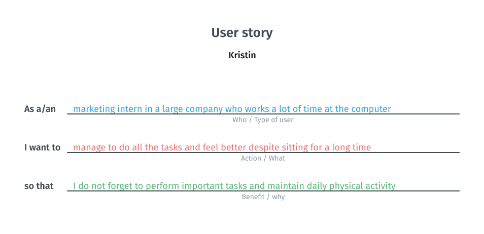
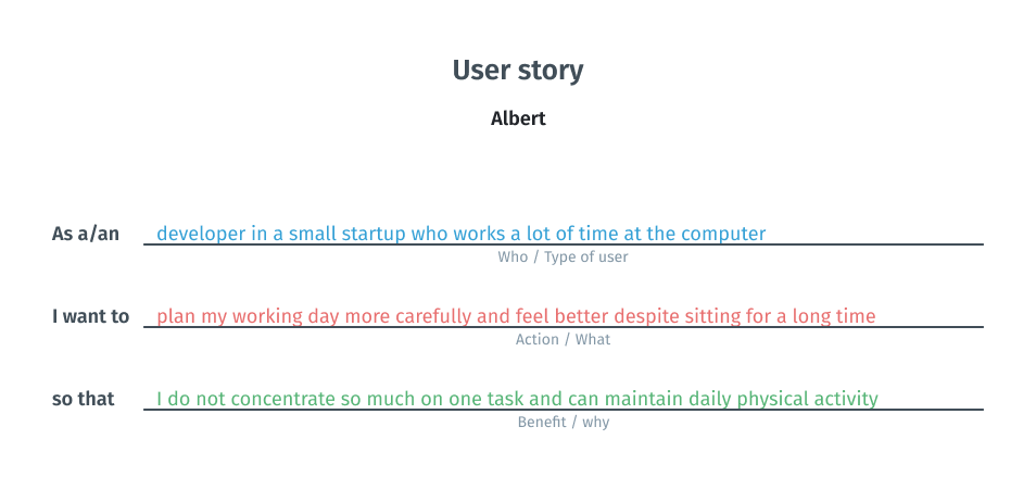
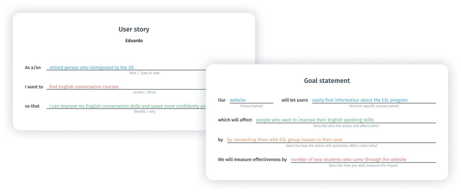
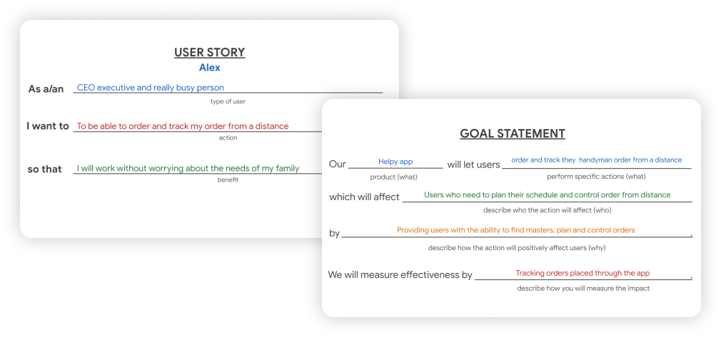
User story
At this stage, I created two user stories. I relied on previous reflections and conclusions and tried to look from the persona’s point of view to inspire and inform design decisions.
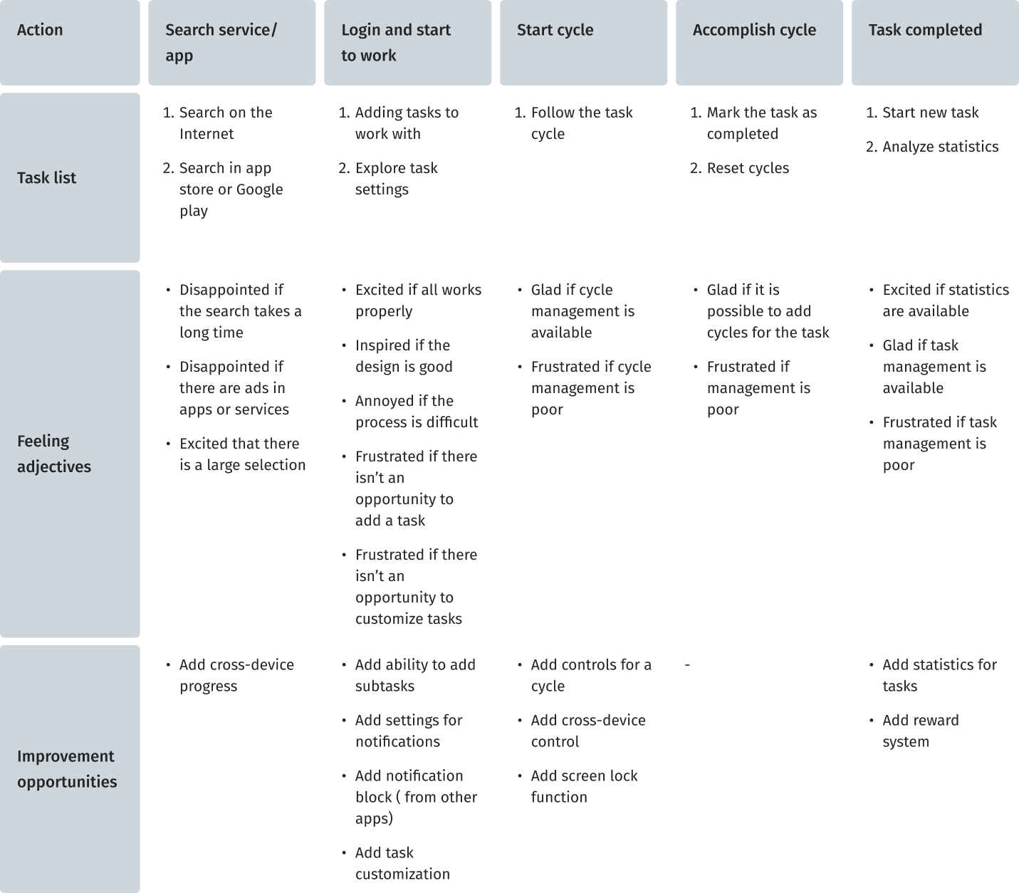
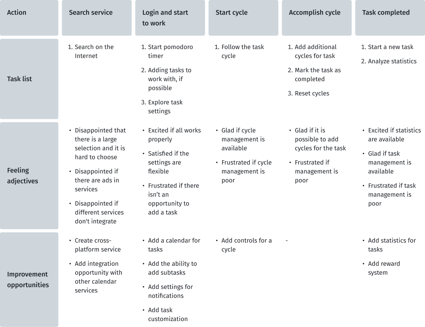
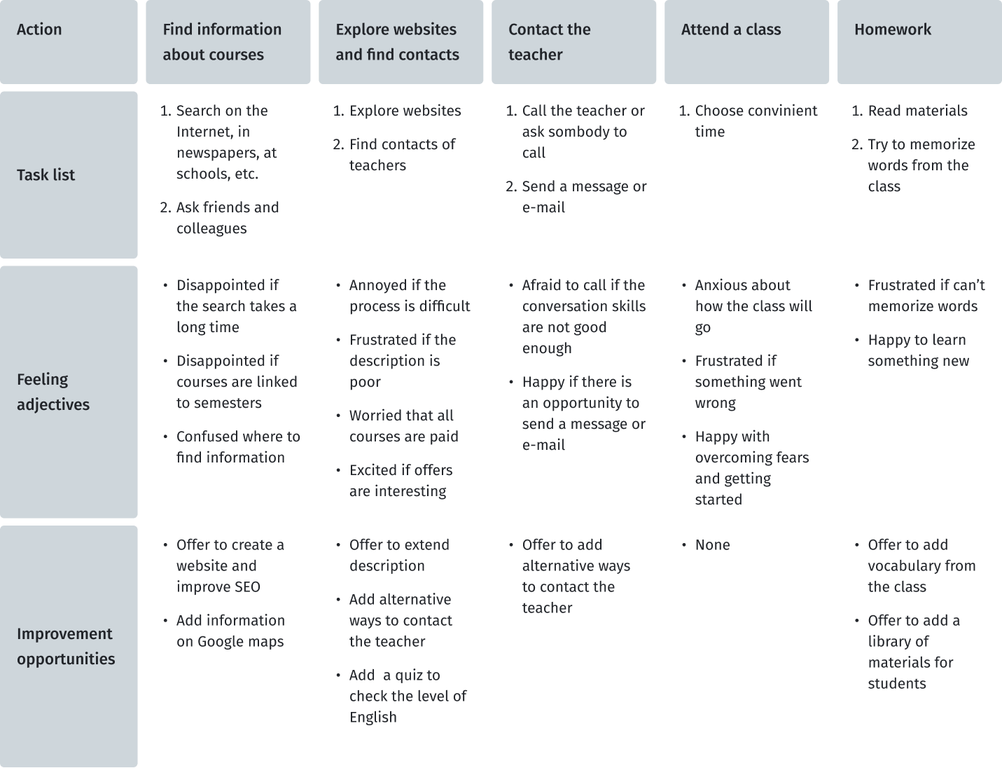
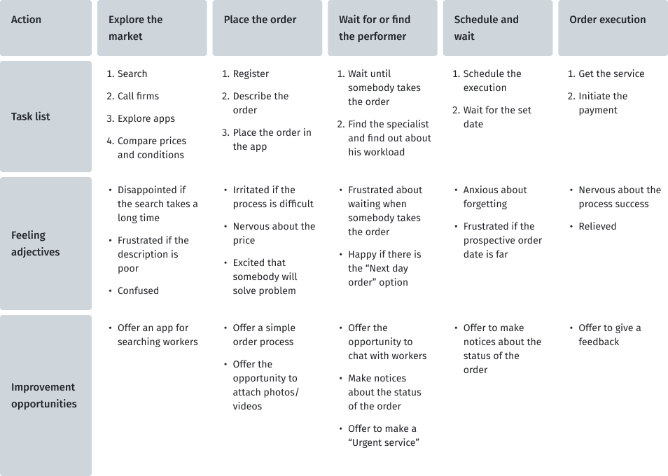
User journey map
At this stage, I created two user journey maps for my personas to imagine the user's scenario of the user journey when he uses pomodoro timers to improve his productivity. I found out which steps contain possibilities that could be developed in my project.
Due to the fact that this future service is not only the use of pomodoro technique, I will try to collect information from users who have used services and tools for planning, taking into account the user experience that users of pomodoro technique applications have.
User journey map for Kristin
User journey map for Albert
Define
It is time to merge the insights from empathy maps, personas, and user journey maps. The next step was to identify the user's problems, which would then be solved during the next stages of product development.
Key pain points of users
Based on the data obtained during the research and emphathy stages, I designated the pain points that users face.
01
Distraction
By mobile phone notifications, social media, etc.
02
Procrastination
Hard to start a new task or just work
03
Interruption
By colleagues and urgent new tasks
04
Health
Feeling unwell after many hours at the computer
Problem statement
Problem statement is a powerful, fundamental tool for defining and aligning on problem solution, which helps:
- capture the user and the need
- keep to a concise goal
- identify benchmarks and measurements for success
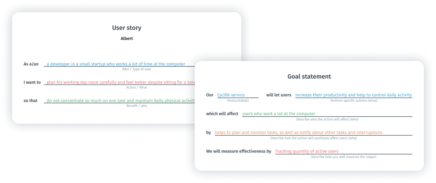
To formulate the problem statement, I performed two steps such as goal statement and creating user story. This technique allowed me to concentrate on users’ needs.
Steps to problem statement for Kristin
Steps to problem statement for Albert
To define the statement, I used a basic formula that summarizes who a particular user is, the user's needs and why these needs are important to this user. The final statement of the problem for Kristin becomes:

Problem
Kristin is a marketing intern who wants to do all the tasks and feel better despite sitting for a long time because she works a lot at the computer and has a lot of responsibilities.
And for Albert:
Problem
Albert is a developer who wants to allocate his work time more efficiently to all tasks and feel better despite sitting for a long time because he works a lot at the computer.
Ideate
Once I had completed the first two stages, I identified some unmet user needs. The third phase in my design-thinking process was Ideate: generate a set of ideas to address those unmet needs.
How Might We?
I use the HMW (How Might We) technique to generate possible problem solutions.Some ideas came from the competitors’ audit. I generated a bunch of different questions and sifted them to exclude any overlap between them and put some of them into one broader HMW. After that, I prioritized my HMWs in terms of their impact on the project’s success. The final list of questions:
- “How might we help users create long-term task plans?”
- “How might we help users create complex tasks?”
- “How might we create continuous experience of interaction?”
- “How might we keep users’ focus?”
- “How might we captivate users?”
Solutions
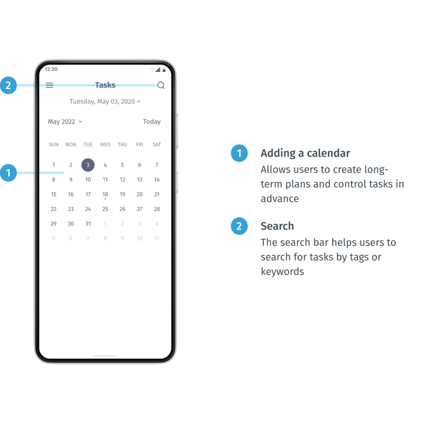
- Adding a calendar
Providing the ability to use the calendar will allow users to create long-term plans and control tasks in advance. This helps to solve the pain point of procrastination, because if you create a plan in advance, it will encourage you to take action. Also it helps to solve the interruption pain point (when some urgent tasks interrupt main tasks and you can forget to return to what you were doing before); - Subtask feature
Providing the subtask feature allows users to flexibly adjust the tasks;
- Cross-platform and cross-device service
Fulfilment connection and seamless transition between devices and the platform will provide users with more flexibility and new scenarios of use;
- Blocking notifications
The opportunity to block certain notifications from other apps (such as social media, mail, news) helps to solve the destruction painpoint;
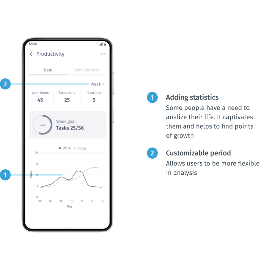
- Adding statistics
Some people have a need to analiyze their life. It captivates them and helps to find points of growth;
- Adding elements of gamification
This is a really complex and multidisciplinary task. But it would be a powerful tool to attract and motivate people to follow their plan. This can be implemented with achievements and tips for doing exercises.
Storyboard
I created a big picture storyboard which tells us about Kristin’s typical work day. This is a really great way to convey the emotions and the basic ideas of the product to other people.
Creating a storyboard for Kristin lets me show her experience in a normal life situation and demonstrate how she can keep track of her tasks during a busy day and how this app can help her organize her working day.
Prototype / application development
The two final stages involve evaluating design ideas with real users to see how well those solutions work. It was an iterative process where I tested my ideas on a prototype with different fidelity and tried to find out if it did not work as well as I thought and if it needed to be refined.
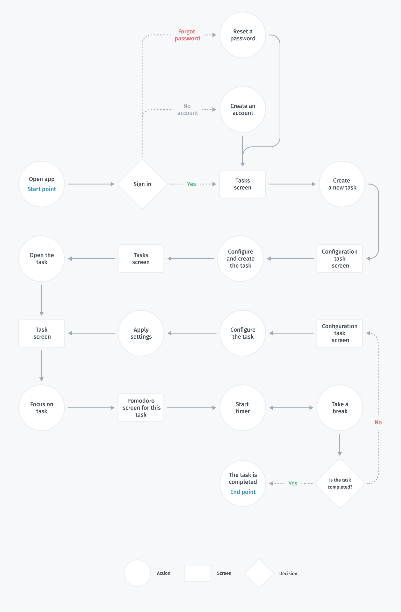
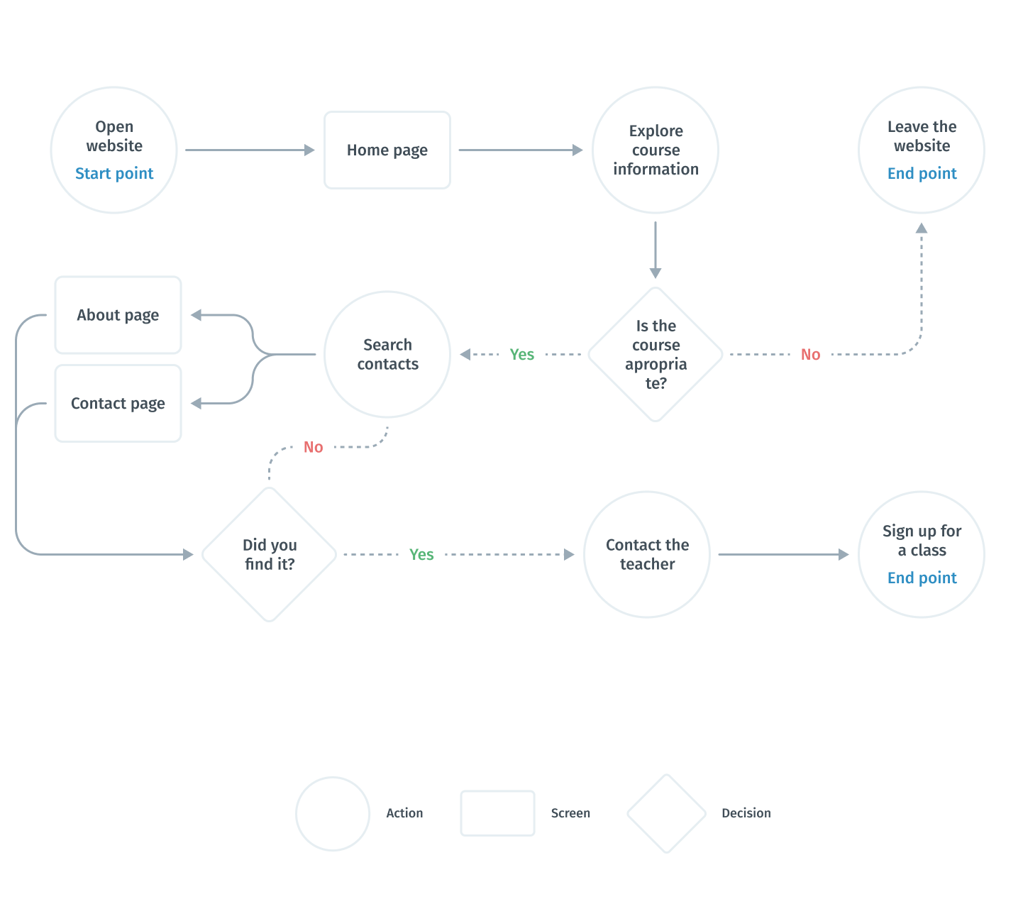
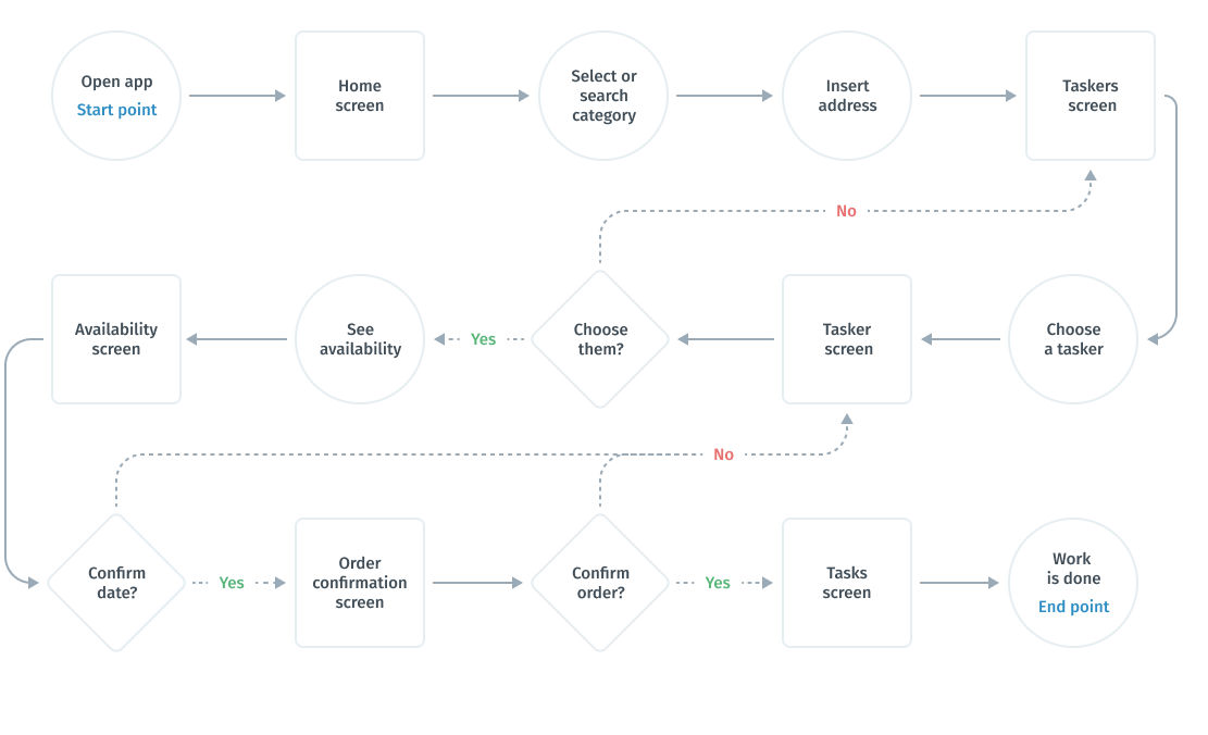
User flows
After realizing what problems we are interested in solving, I built a flowchart for the main user flow (creating and tracking tasks) that would help me make sure that I had a solution for each of them. At this stage of the development process, I aimed to provide the same features to users regardless of the type of device. Therefore, the main user flows for creating a task for the user will be the same.
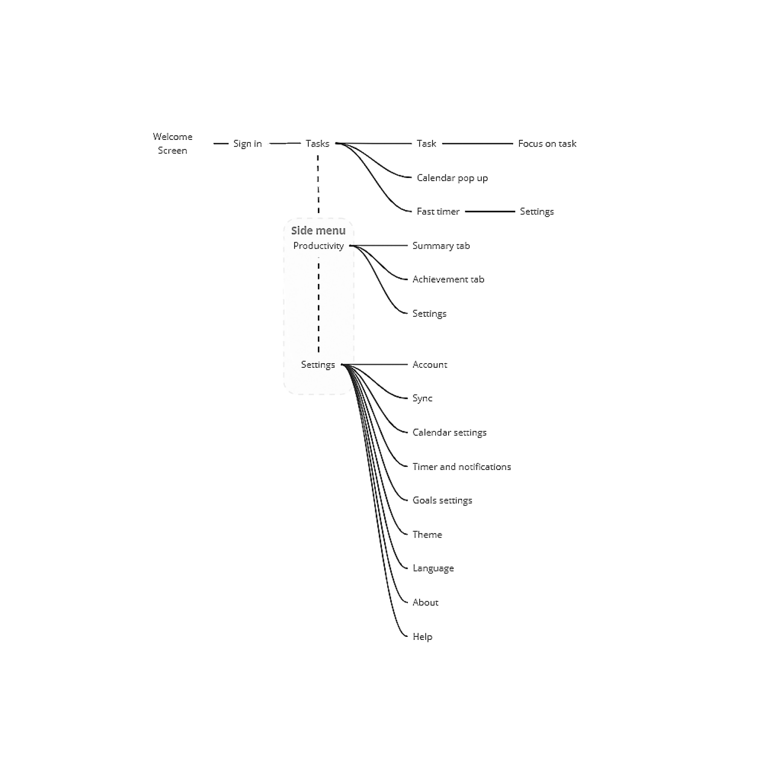
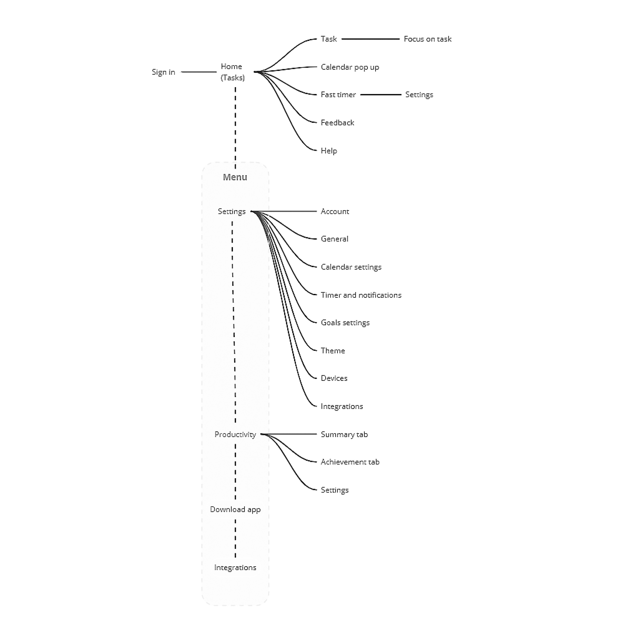
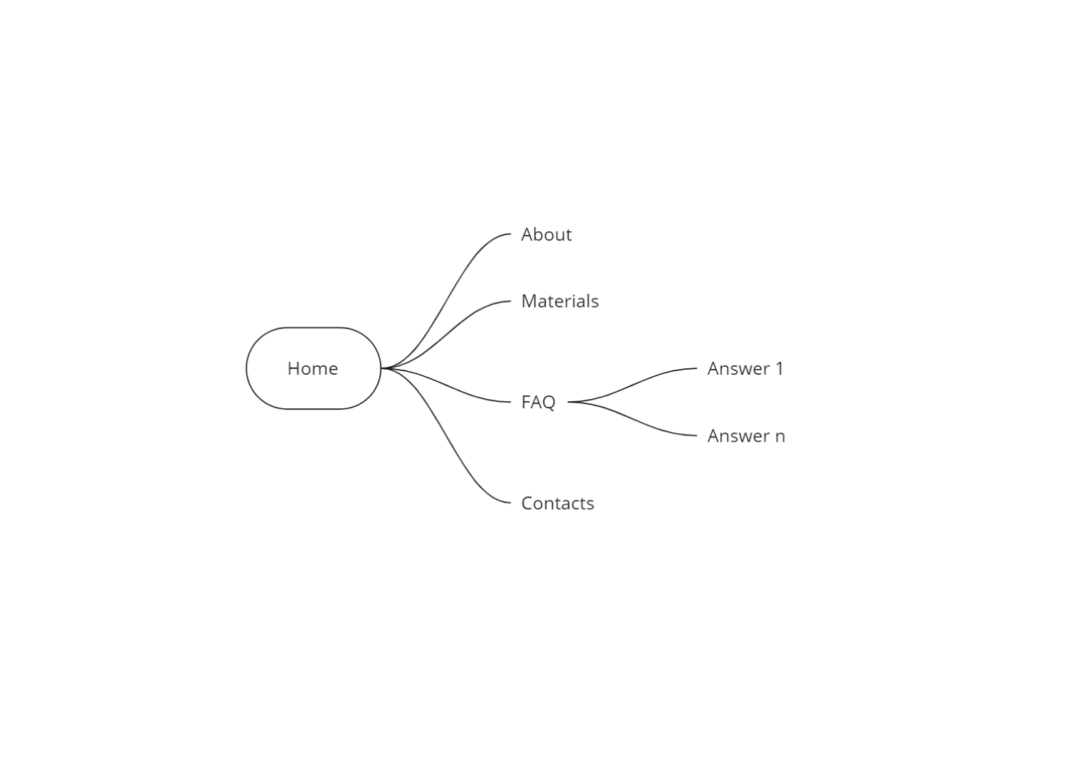
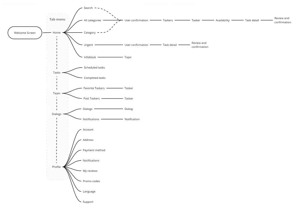
Information architecture
Once I had created the user flow and discovered what features I needed and how they would be organized, I translated these ideas into an information architecture tree. This helped me understand which screen states and models I needed to design.
I used Miro to speed up the process.
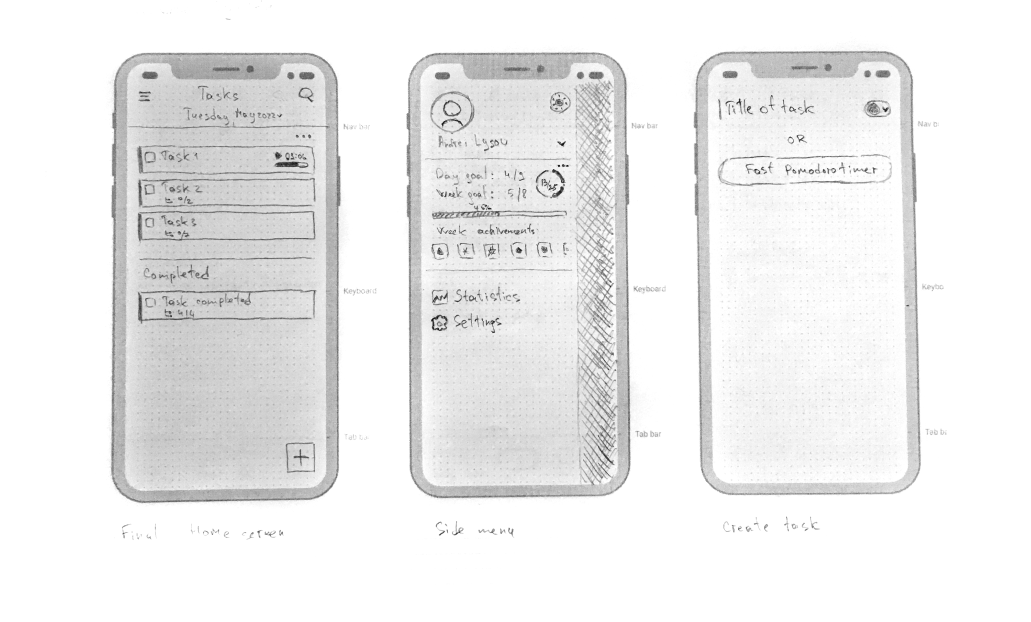
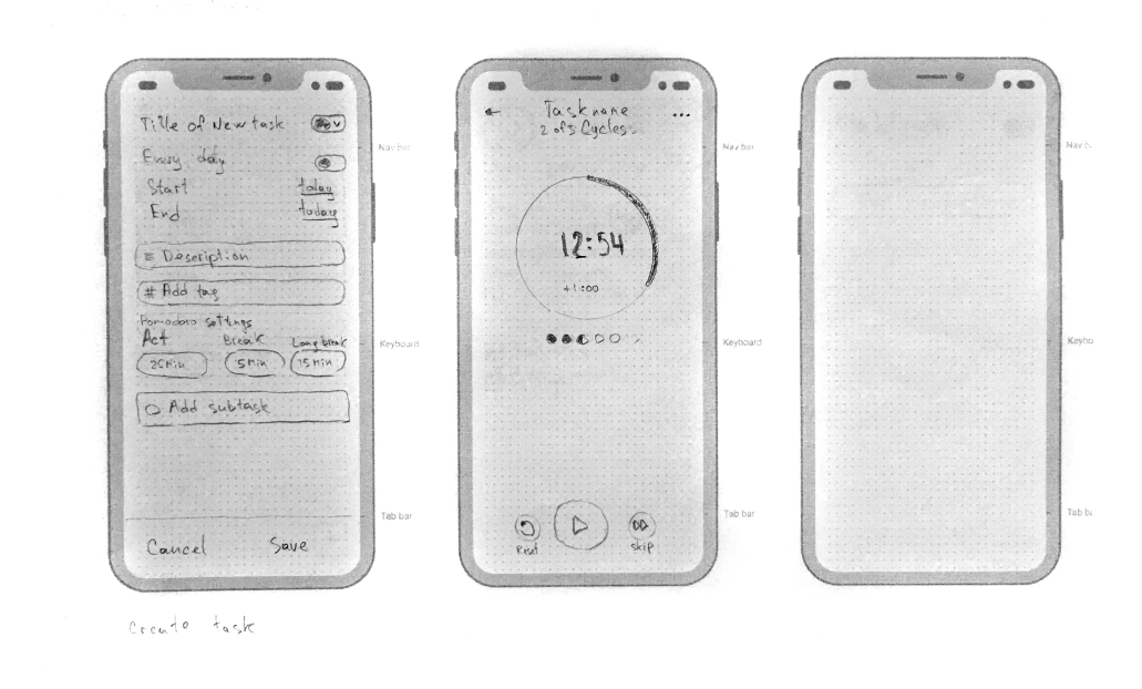
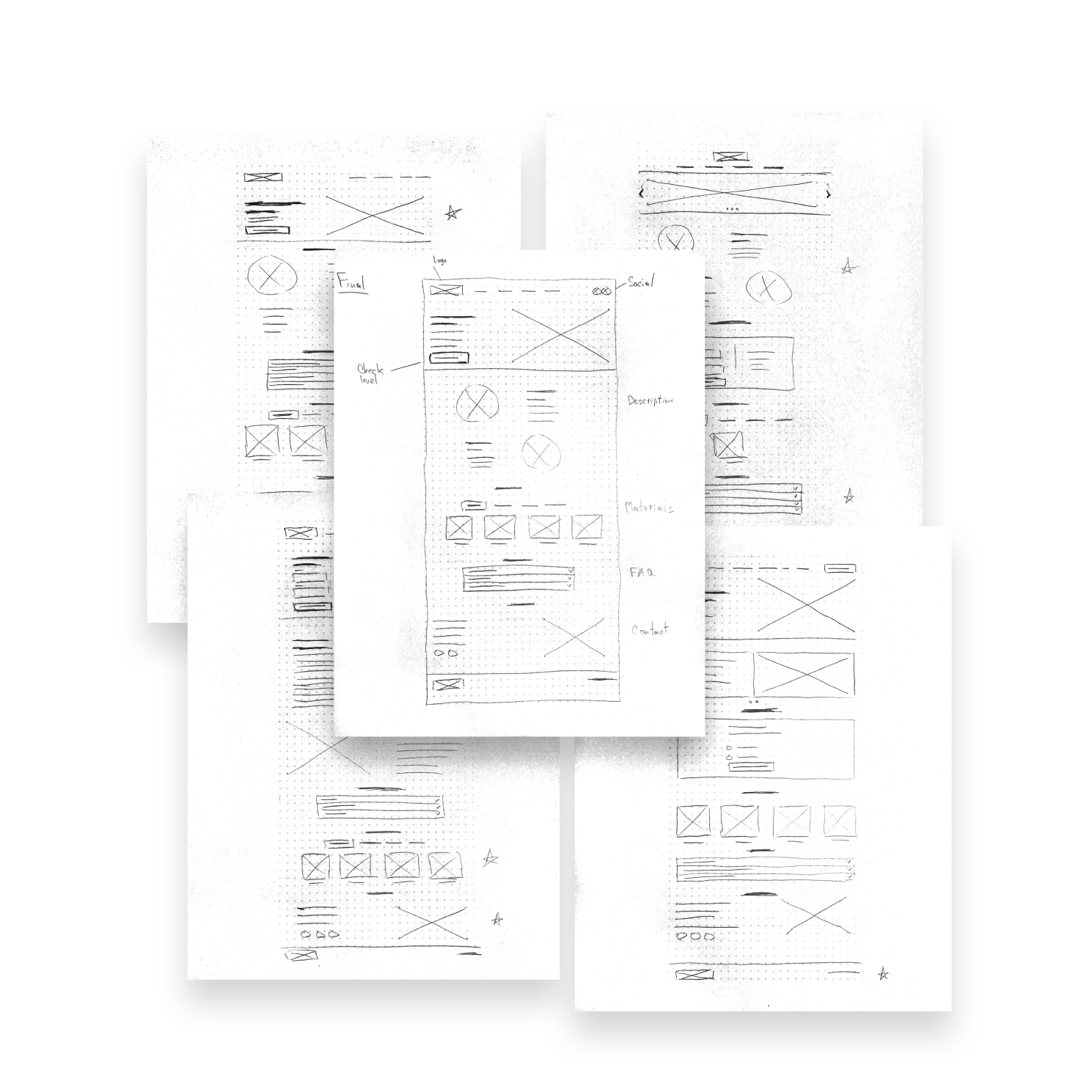
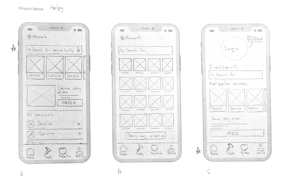
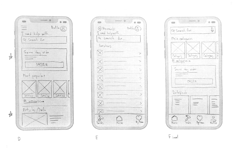
Paper wireframes
Taking the time to draft iterations of each screen of the app on paper ensured that the elements that made it to digital wireframes would be well suited to address user painpoints. For the main screen, I preferred a clean and simple interface that focuses on the task list.
I made several different versions of the home screen and compiled them into a final version. After that, I did the same work for other key screens of the user flow.
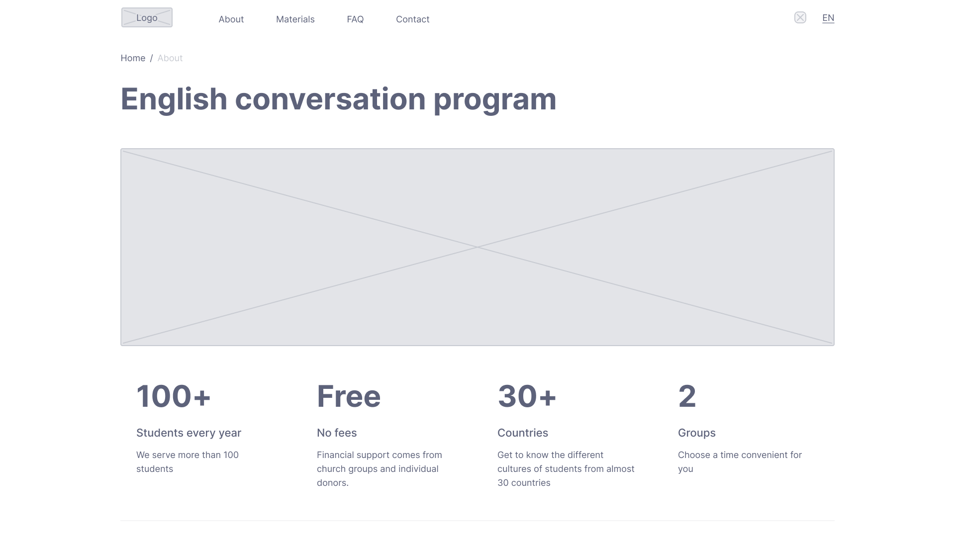
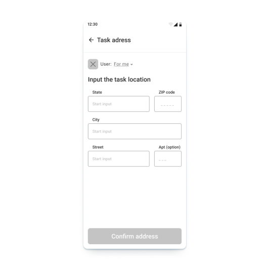
Digital wireframes
At the initial design stage, I made sure that the design of the screen was based on the results of user research. This is the first framework that demonstrates design thinking consistent with previous findings.
The ability to add tasks using a calendar will allow users to plan their actions in advance. The search function will help users to search for tasks faster.
The flexible statistical center will allow users to analyze their activities in order to understand problems and find points of growth.
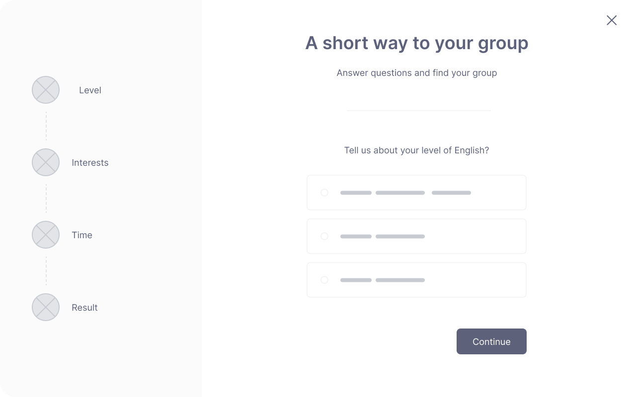
Low-fidelity prototype
Using the complete set of digital wireframes, I created a low-fidelity prototype. I made two primary user flows for creating and focusing on the task so that the prototype could be used in a usability study.
Link to prototype in FigmaScreenshot of low-fidelity prototype in Figma
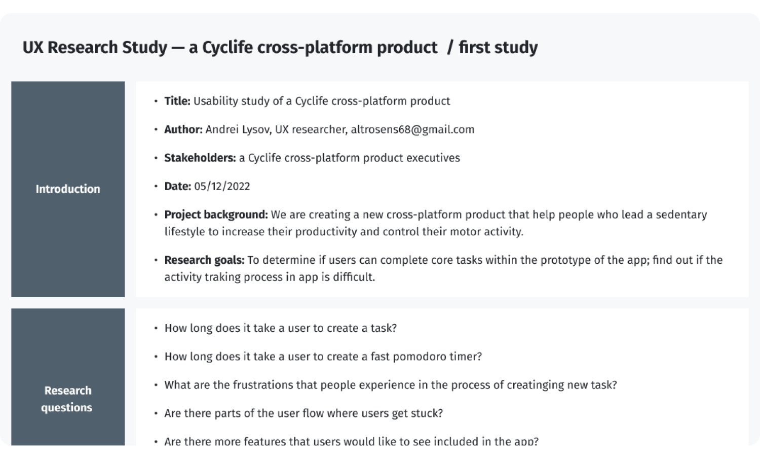
Usability studies — Round 1
UX Research Study script — Round 1
After gathering the data from the UX Study, I used the Affinity diagram to process the result.
Affinity diagram of the first round of research
Findings from the first study guided my design thinking from wireframes to mockups.
Round 1 findings
- Users need better hints at the task creation stage
- The quick pomodoro function should be moved to the task creation screen
- The focus on the task should be constantly visible on the task screen
Design iterations after Round 1 of study
I collected all the information I received and made some improvements at the current stage of development.
I will use the information about the task creation page and the necessary visual prompts at further stages. This will require some iteration and testing in the future.
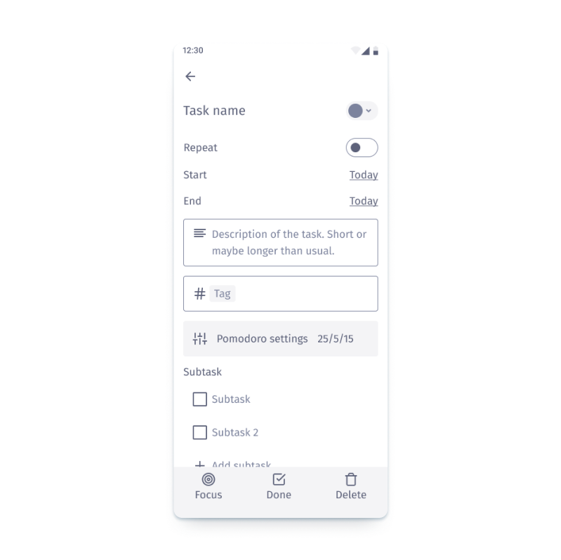
I moved “focus on task“ to the panel to "pin it".
I also moved the “Fast pomodoro” function to the task creation screen.
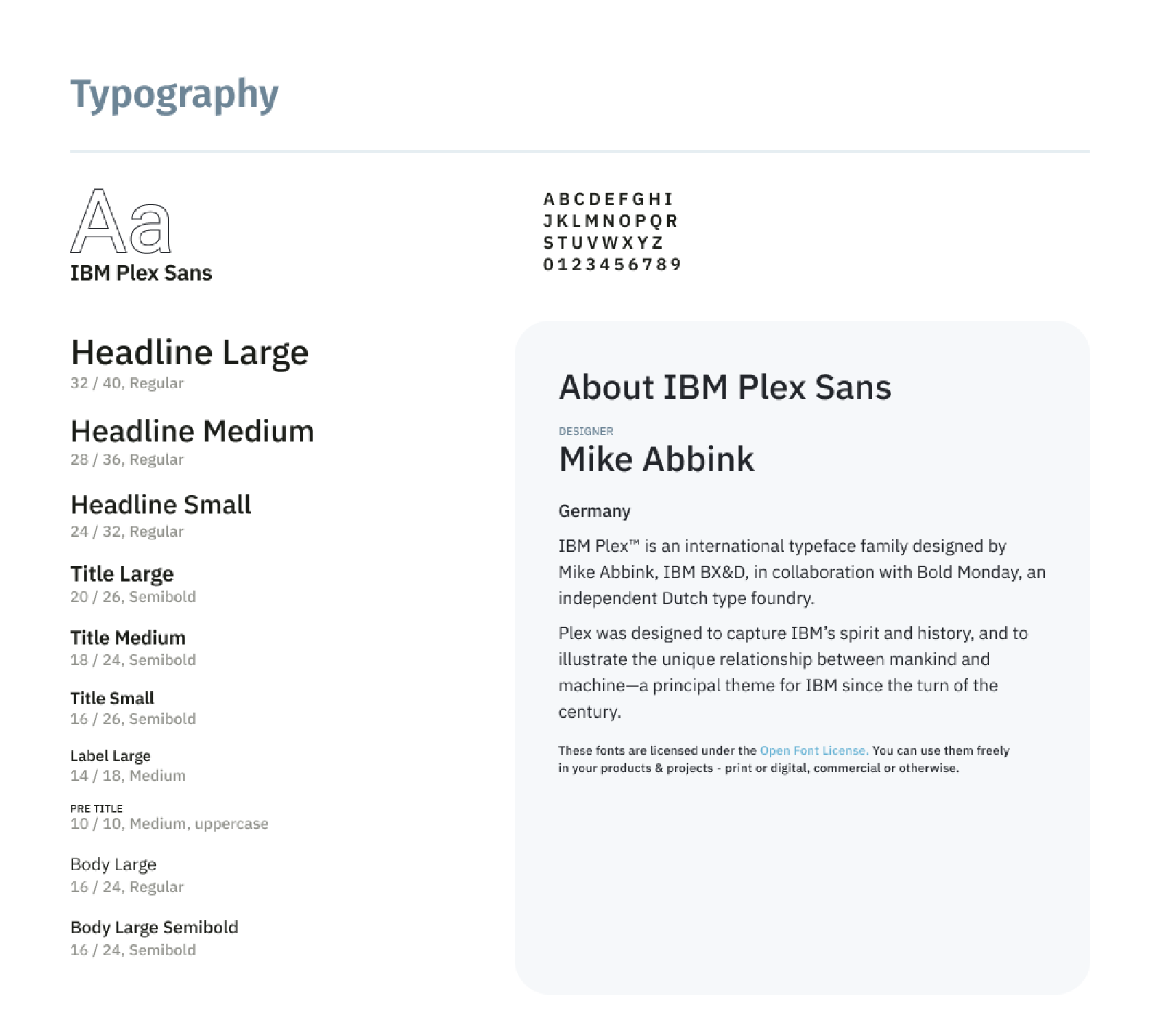
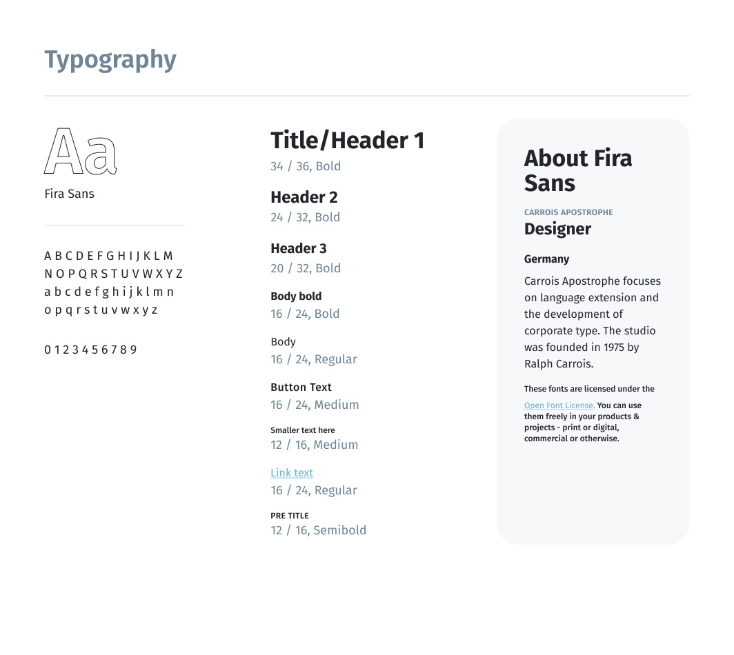
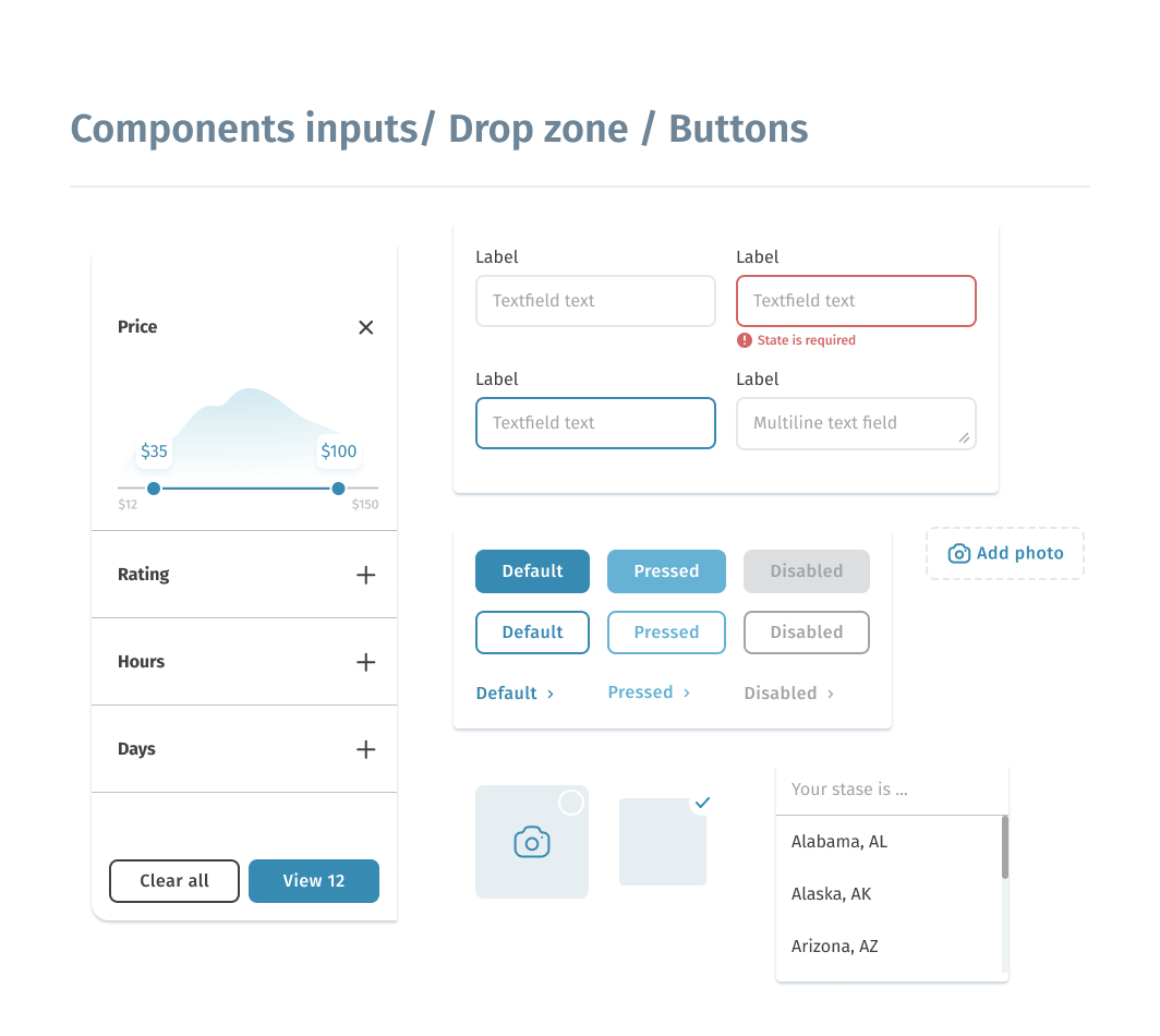
Style guide
After implementing the improvements to the low-fidelity prototype, it was possible to switch on the creating style guide and high-fidelity prototype.
As a source of inspiration and the main reference, I used Google Material Design 3.0. A convenient color scheme generator and a token system allow you to quickly and flexibly adjust the set of system design.
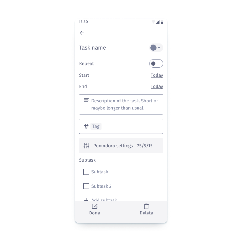
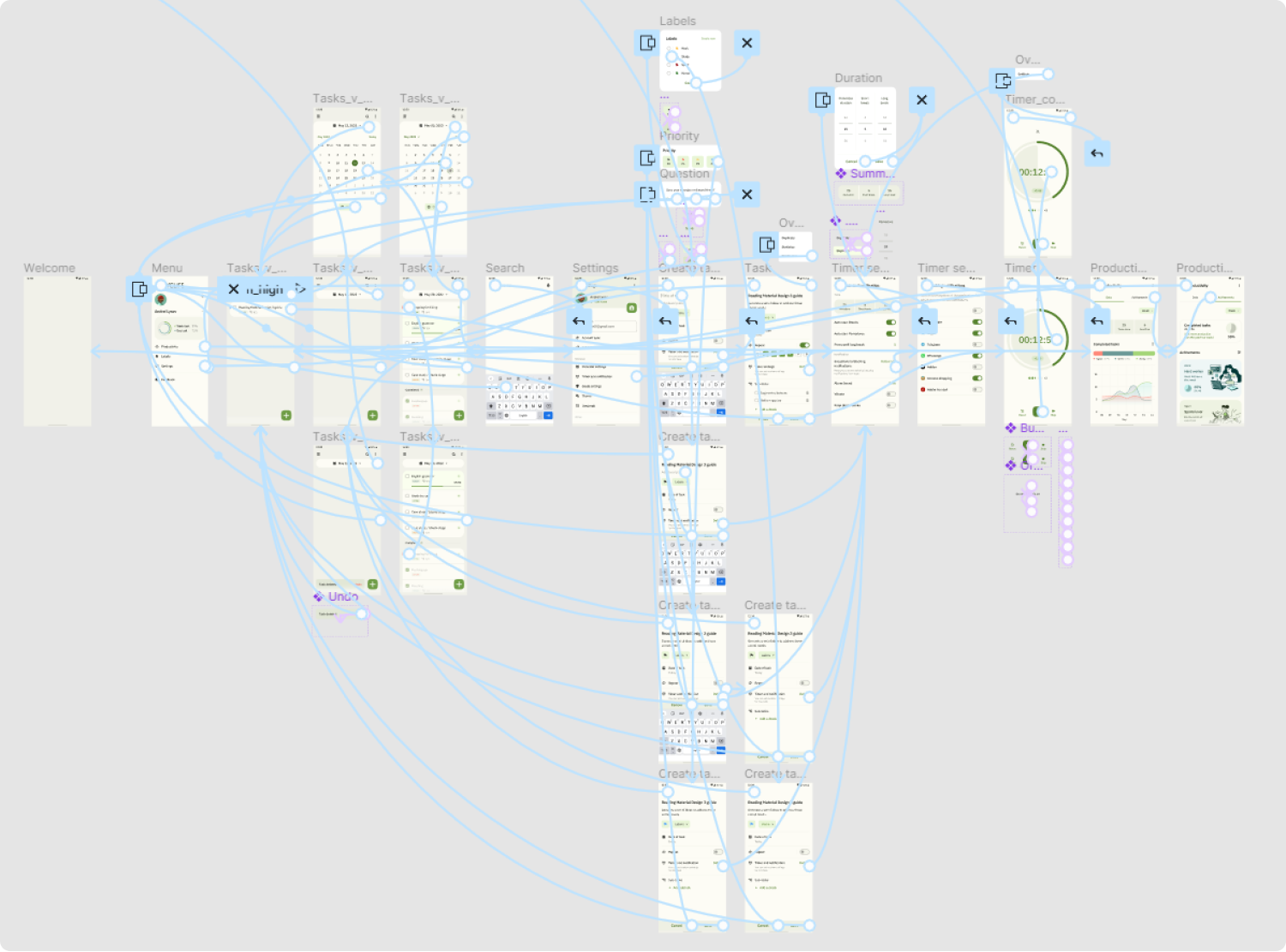
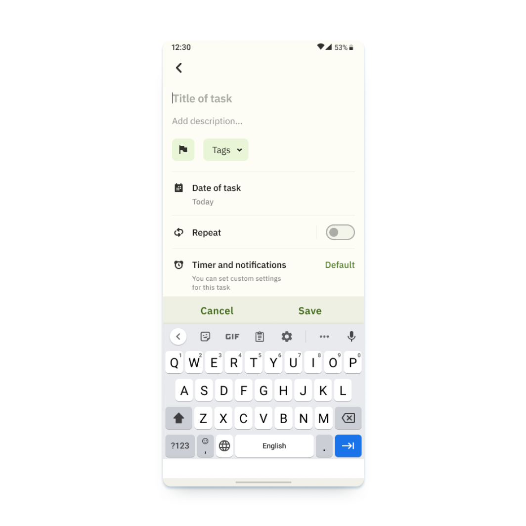
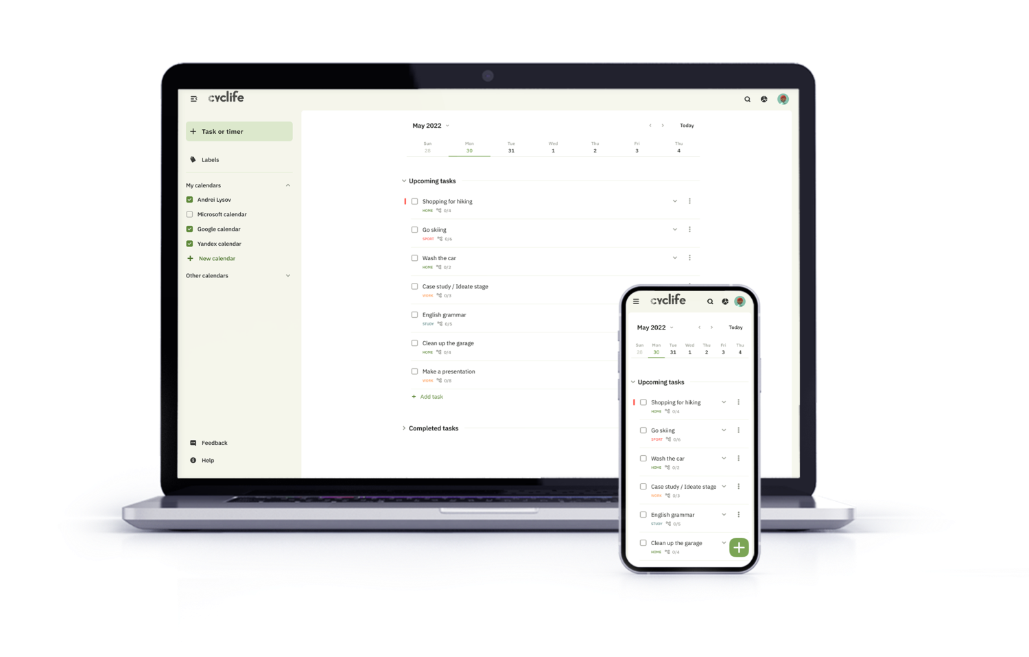
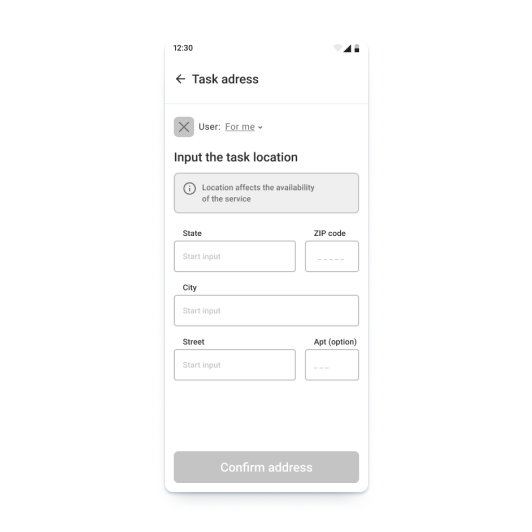
High-fidelity prototype
The high-fidelity prototype introduced cleaner user flows for the task creating process.
The prototype implements two main scenarios of user flows, such as creating a new task and creating a fast timer. There are also additional functions, such as changing dates and timer settings, viewing statistics and achievements.
Link to prototype in FigmaScreenshot of high-fidelity prototype in Figma
Usability studies — Round 2
After finishing the work on the high-fidelity version of the prototype, it was time for the second round of usability testing with users. I used the same tools for this activity: moderated usability study and Affinity diagram for the processing of results
(Full version UX Research Study script — Round 2.pdf).The second study used a high-fidelity prototype and revealed what aspects of the future app must be refined.
Round 2 findings
- The calendar function on the home screen should be moved and separated from other elements to avoid incorrect clicks
- It is preferable to use labels instead of tags
- Additional features are needed to manage the task in the list. For example, deleting a task
Design iterations after Round 2 of study
The earlier design of the main screen had a row with interactive elements and a calendar. Due to the fact that several respondents made incorrect clicks, I separated this block and made it bigger.
In addition, the second round of usability research showed that some users had problems with the meaning of the tags function. For this reason, I replaced the name with labels, as in most services.
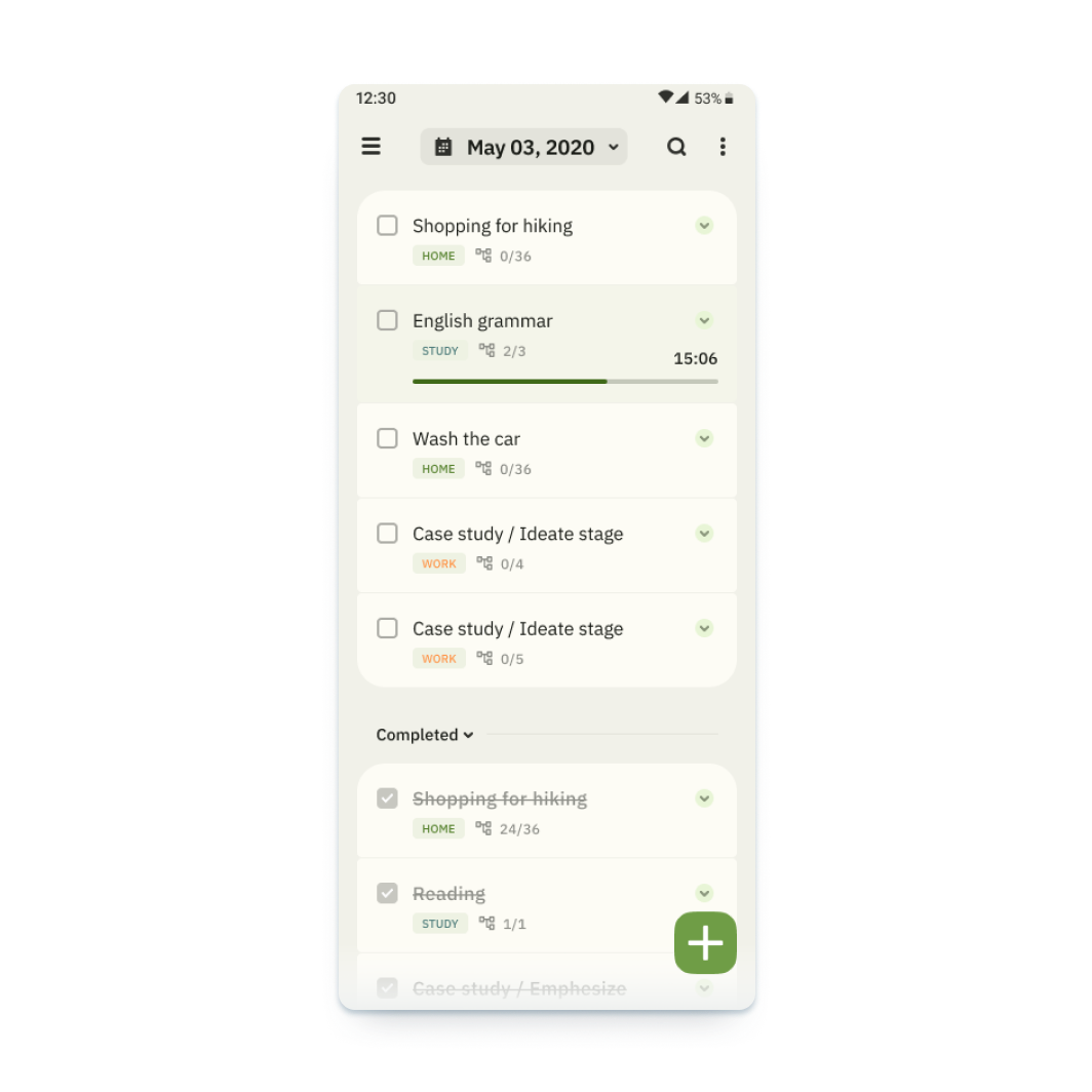
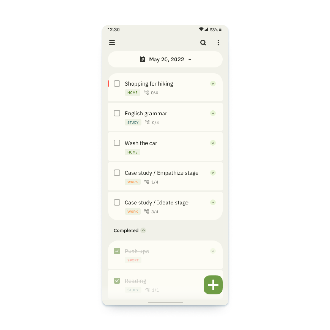
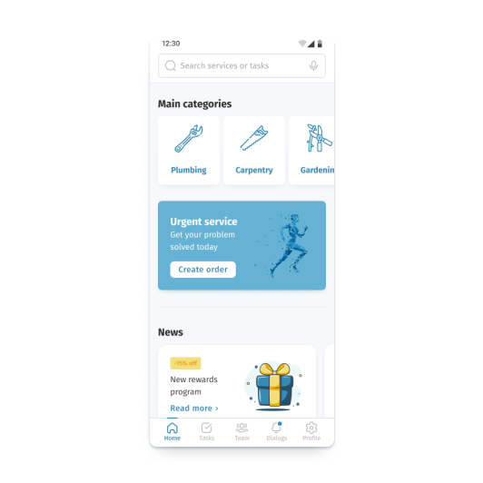
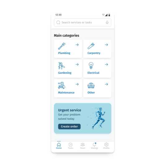
Final design and main features
After the second iteration of the study and all the works, I managed to accomplish the prototype, which matches all originally set tasks.
Creating task
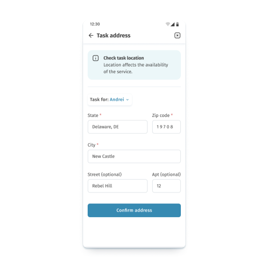
Create tasks and customize them to your needs
Creating subtask
Add subtasks for complex tasks
Calendar
Use the calendar for long-term planning
Blocking notifications
Keep your concentration by using the focus and notification lock function
Statistics
Track your statistics in general and for specific tasks
Gamification
Set up goals and track your progress
Pomodoro technique
Flexibly adjust and use the pomodoro technique to maintain your concentration
Prototype / responsive website design
After completing the work on creating the application, I went on to develop a web version of the service. I followed the same approach when creating the web version of the product, except for using paper sketches.
Since I have already analyzed the methodology in detail using the example of working on the application and since we had the necessary design system, I will move on to the most interesting part of the development, namely high-fidelity prototype. I will omit the iteration stages of the low-fidelity prototype. I will add only information about the information structure that has undergone changes.
Information architecture
The information architecture of the application has been adjusted to match the usual patterns of user behavior.
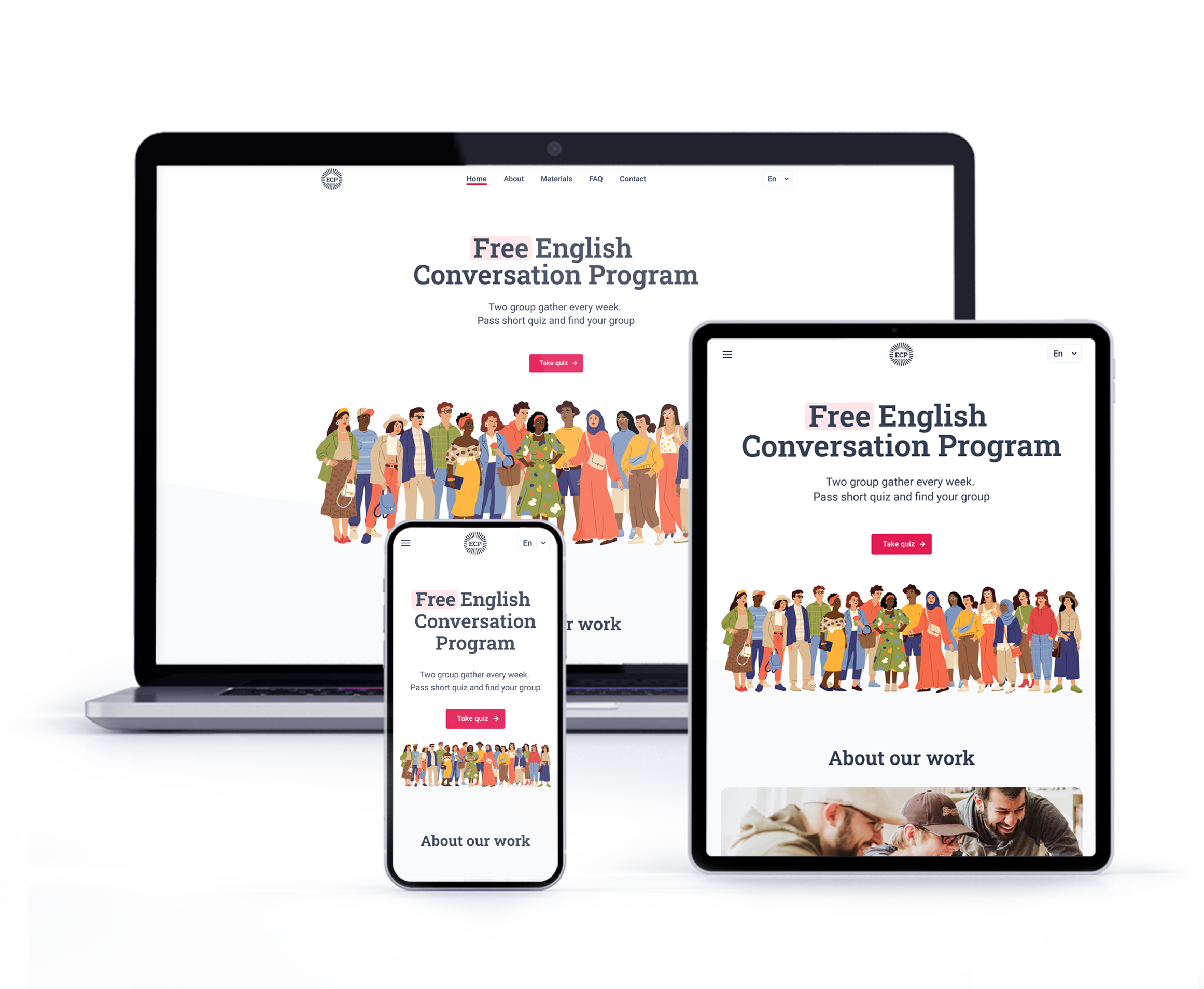
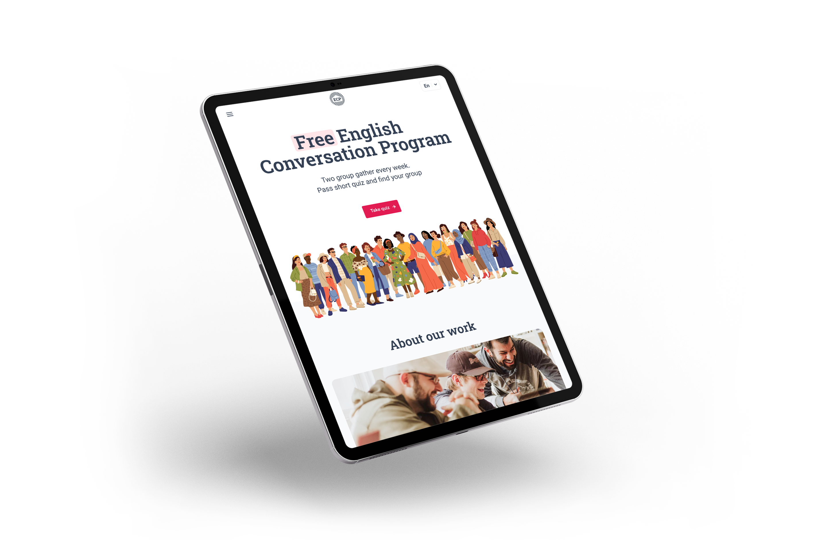
High-fidelity prototype
The prototype implements the basic user flow for creating a task and also provides access to identical functions available in the application, such as changing dates and timer settings, viewing statistics and achievements.
Link to prototype in FigmaScreenshot of high-fidelity prototype in Figma
Final design and main features of responsive design
Let's look at the implementation of the same functions in the web version of the service.
Work with tasks
Create tasks and customize them to your needs.
Other functions
Track your statistics, set up goals, and watch your progress.
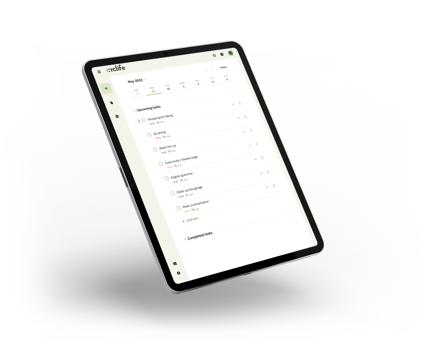
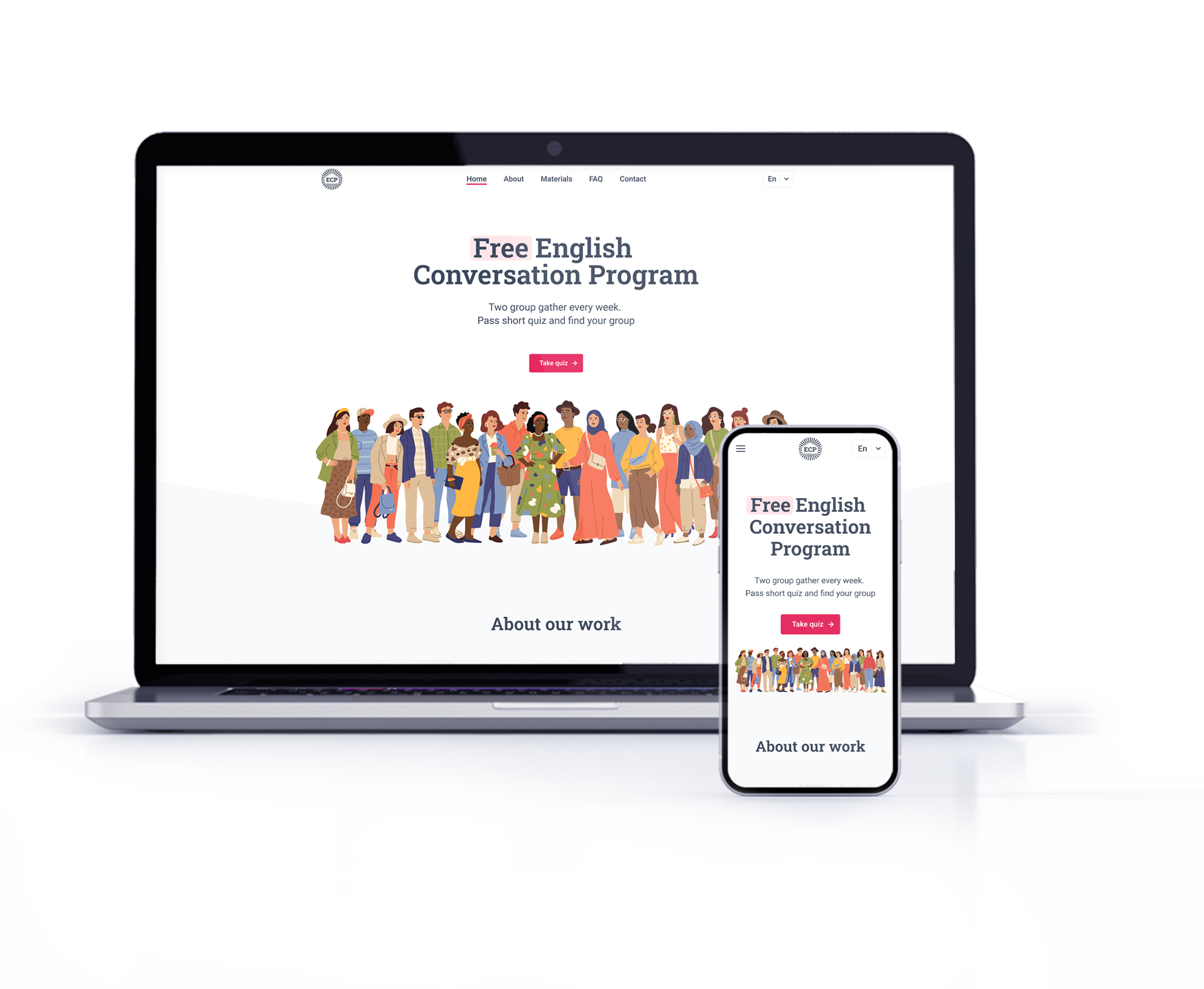
Responsiveness
The web version is adapted for mobile devices and laptops. I optimized the design to fit specific user needs of each device and screen size.
Website on laptop and phone
Final design and main features
After the second iteration of the study and all the works, I managed to accomplish the prototype, which matches all originally set tasks.
Accessibility considerations
01
Time
Added alt text to images for screen readers for vision impaired users
02
Reliability
Used icons to make navigation easier
03
Urgency
Added multiple language to choose from
04
Money
Chose a color palette with an acceptable contrast ratio based on the WCAG 2.0
Takeaways
I managed to implement a solution for all the user problems that had been identified at the initial stage of development, and created a solid starting point for the further development process.

Impact
I managed to implement all the goals outlined at the beginning of the development. A multiplatform service can be an excellent assistant in shaping your schedule and will also allow you to pay more attention to your health.
What I learned:
While designing the Cyclife app, I found out that the formation of a stable multiplatform system requires the study of many nuances related to the features of the platform and potentially integrated systems.
It is worth carefully studying the integrated services in order to preserve the possibility of compatibility.
Next steps
01
Smart watch app
Smart watches have become a part of our life and a convenient assistant. Creating a separate application for its collaboration in the ecosystem would be an extremely necessary step.
02
Achievement system
Detailed study of the system of statistics and achievements. Create ratings and add the ability to compete with friends.